Design Principles - Week 1 Entry
03/01/2022 - 09/01/2022 (Week 1)
WONG JUN ZHE / 0353613
Design Principles / B'Creative Media / Taylor's University
Task 1 - Week 1 Recap

LECTURE
Design Principles
In this week's lectures, Dr. Charles introduced us to the Design Principles.
Let's talk about what DESIGN is. Design is practical. A designer is a practical person who designs to solve problems. However, before one becomes a designer, one must master the language of visuals.
What is a VISUAL? A visual is not a drawing, not a painting, not an object... but what the eye sees and captures. A visual depends on our way of deciphering things we see: where we start looking, how we look at it, etc.
Elements of Design: *If design is a human, what is it made out of?*
- Point - the simplest element
- Line - does not necessarily be a physical line, it could be a imaginary line too
- Shape - 2D, rectangles, polygons, circle, organic shapes, etc
- Form - 3D, Geometric
- Texture - smooth? rough?
- Space - indefinable, however, the space of a picture is defined by its edges
- Colour - the visual byproduct of the light spectrum
Principles of Design: *Elements need principles to function*
Main Principles:
- Figure/ground - Importance? Which is dominant? Which is the foreground / middle ground / background?
- Unity -
- Variety
- Hierarchy
- Proportion
Support Principles:
- Contrast - comparison of very different elements such as, colour, tecture, shape, etc.
- Balance - symmetrical, asymmetrical, radial
- Emphasis - making one thing stand out / dominate the entire design
- Rules of Third
- Repetition/Pattern/Rhythm
- Movement
- Alignment
- Harmony
Perception of Design: *How do you and I perceive/decipher a design?*
Gestalt Theory
Gestalt is about how we shape and perceive things, how we put complex and confusing shapes together and make sense of it, and in the end shows unity.
Similarity is not what objects are like, but what objects look like.
Dissimilarity resists grouping and tends to show more variety. However, the dissimilar objects can form a group of dissimilarities.
There are various ways to make objects look alike or different to each other. For example, size, colour, shape, texture, etc.
Proximity refers to the placement of objects. It depends on the distance, overlapping, combining, touch, etc. of an object with another object. The placement of objects is important because it shows which object dominates.
The touching of objects gives a sense of unity or combination. Touching helps dissimilar objects unite.
Alignment is widely used in visual organization. In alignment, the main element are lines, no matter it is a physical line, an imaginary lines or whatsoever, its main goal is to align. Most common tools of alignment are rectangles! Most composition start with rectangles, as they are the simplest shape for trimming and cropping. 2 main types of alignment are center alignment and edge alignment.
PRACTICAL
Exercise: Monogram Design
I was required to design a monogram using a letter from my name. So I chose the letter "Z".

Assignment: 2 designs that portrays 2 principles of design
Principle of design 1: Emphasis
Concept
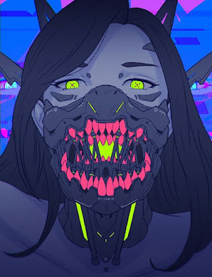
The concept of this design is basically a character wearing a powerful mask, which has a wolf's soul living inside of it. During the ancient times of war, the ancient mask was worn by warriors, believing that the mask provides great demonic powers to them. each mask contains a soul (in this case a soul of a wolf). When activated, the soul takes over the warrior, granting immense power. In the right hands, its power can be used to change people's lives for the better. However in the possession of wrong hands, the misuse of its power is enough to destroy half a nation's popularity.
Inspiration


Sketches
Here are some very initial sketches i did using pencils on paper. I was trying to visualize and understand the idea of the character, the mask and the wolf's soul from different angles.


Then, I scanned my artwork and inserted it into my computer to do some digital colouring. At this stage, the work is still very rough, as I am just exploring.
The main focus is the mask and the wolf, which I coloured with a striking red colour. The use of striking red is important because it lets the viewer identify the main focus of the design with ease.
Also, I made the character wear the mask to signify the activation of the mask's power, and the wolf's soul taking over the character's body.
I think the position of the main focus within the frame is not the best, as it is positioned as the background. The emphasis of the design should be in the foreground or at a larger size. However, I personally do not think it has to dominate the frame too much, because the contrast between bright red and dull green in the rest of the design is already enough to create the emphasis.

Lecturer's feedback:
These questions asked by Dr. Charles made me understand more about my design:
"Tell me more about the wolf and the soul."
"The emphasis on the mask is clear. And the use of striking red adds the contrast you need to draw more attention to it. But why is that important? How to do you position it within the frame? Must it be worn?"
"Emphasis could also mean it dominates the frame. Must it be dominant?"
Things that I should work on now:
"Now, it's a matter of composition, meaning positioning and placement, that best represents the concept. So, keep sketching more alternative ideas. Experiment with material or medium. See it from different perspectives. "
References
https://www.pinterest.com/pin/6896205668391985/
https://www.pinterest.com/pin/34269647155981221/
https://www.pinterest.com/pin/82120393197119325/
https://www.pinterest.com/pin/223209725272221043/
https://www.pinterest.com/pin/422281206663634/


Comments
Post a Comment