Typography Task 1 - Exercises

LECTURES
Week 1
Week 1 - Lecture 1
1. Early letterform development: Phoenician to Roman

|
| Fig 1.1.1 Evolution of Roman Characters |

|
| Fig 1.1.2 Letter 'A' Evolution from Phoenician |
Direction of writing:
Phoenicians and Semitic people: Right to left

|
| Fig. 1.1.3 'boustrophedon' |

|
| Fig. 1.1.4 Greek fragment, stone engraving (Date unknown) |
The Greek: Uses a style of writing called 'boustrophedon' (how the ox ploughs), in a way that lines of texts are read from right to left and left to right alternatively.
*Similar to Phoenicians, The Greek did not use any letter space or punctuation.

|
| Fig. 1.1.5 Late 1st century B.C.E., Augustan inscription in the Roman Forum, Rome |
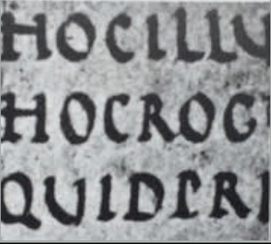
Etruscan and then Romans' improved way of carving letters during the late 1st century B.C.E.: Painting letterforms on the marble before inscribing them, A difference in weight from vertical to horizontal, a broadening of the stroke at the start and the finish can be seen. These qualities are carried into the curved letterforms.
2. Hand script from 3rd to 10th century C.E.

|
| Fig. 1.2.1 4th or 5th century, Square capitals |
Square capitals: Found in Roman monuments. These letterforms have serifs added to the finish of the main strokes.
|
| Fig. 1.2.2 Late 3rd to mid 4th century, Rustic capitals |
Rustic capitals: A compressed version of square capitals. Allowed for two times the word count on a sheet and took far less time to write compared to square capitals. Slightly harder to read.
*Both square and rustic capitals are made for everyday writing. The letterforms are then simplified for speed. Thus, lowercase letterforms are formed as a result of this.

|
| Fig. 1.2.3 4th to 5th century, Uncials |
Uncials: Name derived from the Latin word, 'Uncia', which means the letters are one inch (one twelve of foot) high / simply put as small letters. More readable at small sizes than rustic capitals.

|
| Fig. 1.2.4 C. 500, Half-uncials |
Half-uncials: Further formalization of the cursive hand. Beginning of lowercase letterforms 2000 years after the Phoenician alphabet.

|
| Fig. 1.2.5 C. 925, Caloline minuscule |
Charlemagne: First unifier of Europe since the Romans to standardize all ecclesiastical texts. The monks rewrote the texts using uppercase, miniscule, capitalization, and punctuation which set the standard for calligraphy for a century.
3. Blackletter to Gutenberg's type

|
| Fig. 1.2.6 C. 1300, Blackletter (Textura) |
Blackletter / Textura: With the dissolution of Charlemagne’s empire came regional variations upon Alcuin’s script. In northern Europe, a condensed strongly vertical letterform know as Blackletter or textura gained popularity. In the south, a rounder more open hand gained popularity, called ‘rotunda’. The humanistic script in Italy is based on Alcuin’s minuscule.

|
| Fig. 1.2.7 c. Part of 1455: 42 line bible, Johann Gutenberg, Mainz. |

|
| Fig. 1.2.8 c. 1455: 42 line bible, Johann Gutenberg, Mainz. |
Gutenberg's type: Gutenberg's skills included engineering, metalsmithing, and chemistry. He marshaled all of them to build pages that accurately followed the Blackletter of northern Europe. His type mold required a different brass matrix, or negative impression, for each letterform.

|
| Fig. 1.2.9 Evolution of letterforms Part I |

|
| Fig. 1.2.10 Evolution of letterforms Part II |
4. Text type classification

|
| Fig. 1.3.1 Text type classifications |
Week 2
During class, Mr Vinod gave us feedback on our initial sketches. As he gives comments on our sketches, he also showed us some useful tools and shortcuts in Adobe Illustrator. Some memorable ones are the cut tool, cmd+shift+[ or ], cmd+f.
Week 2 - Lecture 2
1. Describing letterforms

|
| Fig. 2.1.1 Anatomy of a letterform |
Baseline The imaginary line the visual base of the
letterforms.
Median The imaginary line defining the
x-height of letterforms.
X-height The height in any
typeface of the lowercase ‘x’.
|
| Fig. 2.1.2 Stroke |
Stroke Any line that defines the basic letterform

|
| Fig. 2.1.3 Apex/Vertex |
Apex / Vertex The point created by joining two diagonal stems (apex above and vertex below)

|
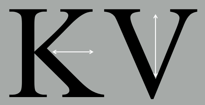
| Fig. 2.1.4 Arm |
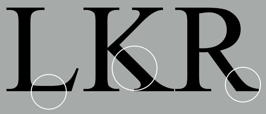
Arm Short strokes off the stem of the letterform, either horizontal (E, F, L) or inclined upward (K, Y).

|
| Fig. 2.1.5 Ascender |
Ascender The portion of the stem of a lowercase letterform that projects above the median.

|
| Fig. 2.1.6 Barb |
Barb The half-serif finish on some curved stroke.

|
| Fig. 2.1.7 Beak |
Beak The half-serif finish on some horizontal arms.

|
| Fig. 2.1.8 Bowl |
Bowl The rounded form that describes a counter. The bowl may be either open or closed.
|
| Fig. 2.1.9 Bracket |
Bracket The transition between the serif and the stem.

|
| Fig. 2.1.10 Cross bar |
Cross Bar The horizontal stroke in a letterform that joins two stems together

|
| Fig. 2.1.11 Cross stroke |
Cross Stroke The horizontal stroke in a letterform that joins two stems together
|
| Fig. 2.1.12 Crotch |
Crotch The interior space where two strokes meet.

|
| Fig. 2.1.13 Descender |
Descender The portion of the stem of a lowercase letterform that projects below the baseline.

|
| Fig. 2.1.14 Ear |
Ear The stroke extending out from the main stem or body of the letterform.

|
| Fig. 2.1.15 Em/en |
Em/en Originally refering to the width of an uppercase M, and em is now the distance equal to the size of the typeface (an em in 48 points, for example). An en is half the size of an em. Most often used to describe em/en spaces and em/en dashes.

|
| Fig. 2.1.16 Finial |
Finial The rounded non-serif terminal to a stroke.
|
| Fig. 2.1.17 Leg |
Leg Short stroke off the stem of the letterform, either at the bottom of the stroke (L) or inclined downward (K, R).

|
| Fig. 2.1.18 Ligature |
Ligature The character formed by the combination of two or more letterforms.

|
| Fig. 2.1.19 Link |
Link The stroke that connects the bowl and the loop of a lowercase G.

|
| Fig. 2.1.20 Loop |
Loop In some typefaces, the bowl created in the descender of the lowercase G.

|
| Fig. 2.1.21 Serif |
Serif The right-angled or oblique foot at the end of the stroke.

|
| Fig. 2.1.22 Shoulder |
Shoulder The curved stroke that is not part of a bowl.

|
| Fig. 2.1.23 Spine |
Spine The curved stem of the S.

|
| Fig. 2.1.24 Spur |
Spur The extension the articulates the junction of the curved and rectilinear stroke.

|
| Fig. 2.1.25 Stem |
Stem The significant vertical or oblique stroke.

|
| Fig. 2.1.26 Stress |
Stress The orientation of the letterform, indicated by the thin stroke in round forms.

|
| Fig. 2.1.27 Swash |
Swash The flourish that extends the stroke of the letterform.

|
| Fig. 2.1.28 Tail |
Tail The curved diagonal stroke at the finish of certain letterforms.

|
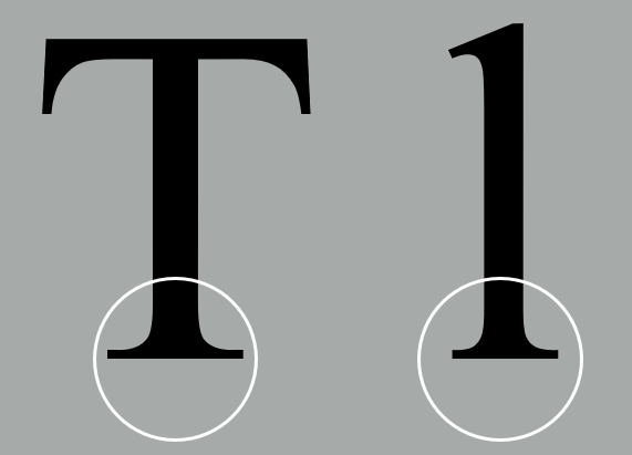
| Fig. 2.1.29 Terminal |
Terminal The self-contained finish of a stroke without a serif. This is something of a catch-all term. Terminals may be flat (‘T’ above), flared, acute, (‘t’ above), grave, concave, convex, or rounded as a ball or a teardrop (see finial).
2. The font
The full font of a typeface contains much more than 26 letters, to numerals, and a few punctuation marks. To work successfully with type, one should make sure to work with a full font and one should know how to use it.

|
| Fig. 2.2.1 Uppercase |
Uppercase Capital letters, including certain accented vowels, the c cedilla and n tilde, and the a/e and o/e ligatures.

|
| Fig. 2.2.2 Lowercase |
Lowercase Lowercase letters include the same characters as uppercase.

|
| Fig. 2.2.3 Small capitals |

|
| Fig. 2.2.4 Lower case vs Small Capitals |
Small Capitals Uppercase letterforms draw to the x-height of the typeface. Small Caps are primarily found in serif fonts as part of what is often called expert set.
*Most type software includes a style command that generates a small cap based on uppercase forms. Do not confuse real small caps with those artificially generated.

|
| Fig. 2.2.5 Uppercase numerals |
Uppercase Numerals aka lining figures, these numerals are the same height as uppercase letters and are all set to the same kerning width. They are most successfully used with tabular material or in any situation that calls for uppercase letters.

|
| Fig. 2.2.6 Lowercase numerals |
Lowercase Numerals aka old style figures or text figures, these numerals are set to x-height with ascenders and descenders. They are best used when ever you would use upper and lowercase letterforms. Lowercase numerals are far less common in sans serif type-faces than in serif.

|
| Fig. 2.2.7 Italic |

|
| Fig. 2.2.8 Italic vs Roman |
Italic Most fonts today are produced with a matching italic. Small caps, however, are almost always only roman. The forms in a italic refer back to fifteenth century Italian cursive handwriting. Oblique are typically based on the roman form of the typeface.

|
| Fig. 2.2.9 Punctuation, miscellaneous characters |
Punctuation, miscellaneous characters Although all fonts contain standard punctuation marks, miscellaneous characters can change from typeface to typeface. It’s important to be acquainted with all the characters available in a typeface before you choose the appropriate type for a particular job.

|
| Fig. 2.2.10 Ornaments |
Ornaments Used as flourishes in invitations or certificates. They usually are provided as a font in a larger typeface family. Only a few traditional or classical typefaces contain ornamental fonts as part of the entire typeface family (Adobe Caslon Pro).
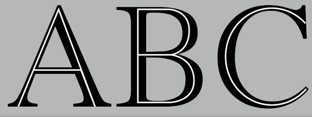
3. Describing typefaces
Once you can recognize the parts of a letterform, you can apply what you know to identify different type-faces. Keep in mind that some, all, or combinations of these styles may be found within one type family.

|
| Fig. 2.3.1 Roman |
Roman The letterform is so called because the uppercase forms are derived from inscriptions of Roman monuments.

|
| Fig. 2.3.2 Different typefaces |
Book A slightly lighter stroke in roman.

|
| Fig. 2.3.3 Italic vs Oblique |
Italic Named for fifteenth century Italian handwriting on which the forms are based.
Oblique conversely are based on roman form of typeface
Boldface Characterized by a thicker stroke than a roman form. Depending upon the relative stroke widths within the typeface, it can also be called ‘semibold’, ‘medium’, ‘black’, ‘extra bold’, or super. In some typefaces (notably Bodoni), the boldest rendition of the typeface is referred to as ‘Poster’.
Light A lighter stroke than the roman form.
Thin Even lighter strokes than 'light'.
Condense A version of the roman form.
Compressed extremely condense styles.
Extended An extended variation of a roman font.
4. Comparing typefaces

|
| Fig. 2.4.1 10 typefaces |
The 10 typefaces mentioned above represent 500 years of type design. They are carefully designed to achieve easy readability and an appropriate expression of contemporary esthetics.
These are some of the typefaces that have surpassed the latter goal. They have remained in use for decades – in some cases, centuries, but are still considered successful expressions of how we think, how we read and write, and how we print.
Once we understand how to use these faces appropriately and effectively, we’ll be well prepared to understand and appreciate other typefaces as we encounter them.

|
| Fig. 2.4.2 'a' and 'R' in the 10 typefaces |
What worth noting are the differences among these typefaces – the accumulation of choices that renders each unique. The Rs display a range of attitudes, some whimsical, some stately, some mechanical, others calligraphic some harmonious and some awkward.
Week 3
1. Tracking: Kerning and Letterspacing
|
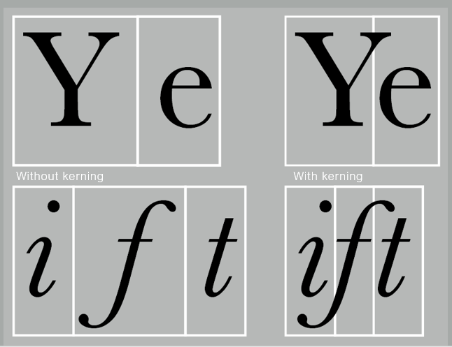
| Fig. 3.1.1 Kerning |
Kerning: The automatic adjustment of space between letters.
Letterspacing: To add space between letters.
*Do not confuse kerning with letterspacing.

|
| Fig. 3.1.2 Normal vs tight vs loose tracking |

|
| Fig. 3.1.3 Normal vs tight vs loose tracking in paragraph form |
Tracking: The addition and removal of space in a word or sentence.

|
| Fig. 3.1.4 Lower case letterforms |
Designers tend to apply letterspacing to uppercase letters, but it is not the same case for lowercase letters. The reason for this is shown in Fig. 3.1.4. Uppercase letterforms are naturally able to stand on their own, whereas lowercase letterforms require the counter form created between letters to maintain the line of reading.
2. Formatting Text

|
| Fig. 3.2.1 Flush left |
Flush left: This format most closely mirrors the asymmetrical experience of handwriting. Each line starts at the same point but ends wherever the last word on the line ends. Spaces between words are consistent throughout the text, allowing the type to create an even gray value.

|
| Fig. 3.2.2 Centered |
Centered: This format imposes symmetry upon the text, assigning equal value and weight to both ends of any line. It transforms fields of text into shapes, thereby adding a pictorial quality to material that is non-pictorial by nature. Because centered type creates such a strong shape on the page, its important to amend line breaks so that the text does not appear too jagged.

|
| Fig. 3.2.3 Flush right |
Flush right: This format places emphasis on the end of a line as opposed to its start. It can be useful in situations (like captions) where the relationship between text and image might be ambiguous without a strong orientation to the right.

|
| Fig. 3.2.4 Justified |
Justified: Like centering, this format imposes a symmetrical shape on the text. It is achieved by expanding or reducing spaces between words and, sometimes, between letters. The resulting openness of lines can occasionally produce ‘rivers’ of white space running vertically through the text. Careful attention to line breaks and hyphenation is required to amend this problem whenever possible.

|
| Fig. 3.2.5 Design and readability |
Designers tend to set type one way or another depending upon several factors, personal preference, prevailing culture and the need to express play important roles.
However, when setting the field of type, keep in mind the typographer’s first job—clear, appropriate presentation of the author’s message.
3. Texture

|
| Fig. 3.3.1 Anatomy of a typeface |

|
| Fig. 3.3.2 Example of lighter mass texts |

|
| Fig. 3.3.3 Heavier mass texts |
Beyond learning all the above, it is important to understand how different typefaces feel as text. Different typefaces suit different messages.
In addition, we should also consider the different textures of these typefaces. A relatively generous x-height or relatively heavy stroke width produces a darker mass on the page; whereas a relatively smaller x-height or lighter stroke produces a lighter mass on the page. Sensitivity to these differences in colour is fundamental for creating successful layouts.
4. Leading and Line Length
The goal in setting text type is to allow for easy, prolonged reading. At the same time a field of type should occupy the page as much as photograph does.
 |
| Fig. 3.4.1 Overly tight text vs overly wide text |
 |
| Fig. 3.4.2 Different line spacing |
Type size: Text type should be large enough to be read easily at arms length—imagine yourself holding a book in your lap.
Leading: Text that is set too tightly encourages vertical eye movement; a reader can easily loose his or her place. Type that is set too loosely creates striped patterns that distract the reader from the material at hand.
Line Length: Appropriate leading for text is as much a function of the line length as it is a question of type size and leading. Shorter lines require less leading; longer lines more. A good rule of thumb is to keep line length between 55-65 characters. Extremely long or short lines lengths impairs reading.
5. Type Specimen Book

|
|
Fig. 3.5.1 Sample type specimen sheet |
A type specimen book/e-book is to provide an accurate reference for type, type size, type leading, type line length etc.

|
| Fig. 3.5.2 Compositional requirement |
Compositional requirement: Text should create a field that can occupy a page or a screen. Think of your ideal text as having a middle gray value (on the left, in the diagram on Fig. 3.5.2), not a series of stripes (as seen of the one on the right).

|
| Fig. 3.5.3 Enlargement of text (400%) |
Week 4
1. Indicating Paragraphs
There are several options for indicating paragraphs, some are more common than the others in today's world.

|
| Fig. 4.1.1 Pilcrow as paragraph indicators |
Pilcrow (¶): A paragraph indicator that was passed down from medieval manuscripts seldom use today.

|
| Fig. 4.1.2 Leading as paragraph indicators |
Leading between paragraphs: If the line space is 12pt, then the paragraph space is 12pt. This ensures cross-alignment across columns of text.

|
| Fig. 4.1.3 Leading vs line of type vs line spacing |
*Do not confuse leading with line space

|
| Fig. 4.1.4 Indent as paragraph indicators |
Indent at the start of a paragraph: Typically, the indent is the same size of the line spacing or the same as the point size of your text.

|
| Fig. 4.1.5 Extended paragraphs as paragraph indicators |
Extended paragraphs: This method creates unusually wide columns of text. Despite these problems, there can be strong compositional or functional reasons for choosing it.
2. Widows and Orphans

|
| Fig. 4.2.1 Widow and orphan |
Widow: A short line of type left alone at the end of a column of text.
Orphan: A short line of type left alone at the start of new column.
In justified text both widows and orphans are serious errors that should be strictly avoided. Flush right and ragged left text is slightly more forgiving towards widows, but only a bit. Orphans remain unpardonable.
The only solution to widows is to rebreak your line endings through out your paragraph so that the last line of any paragraph is not noticeably short.
Orphans require more care. Careful typographers ensures no column of text starts with the last line of the preceding paragraph.
3. Highlighting Text

|
| Fig. 4.3.1 Italics and Bold serifs |

|
| Fig. 4.3.2 Bold sans serif and Change in text colour |
Figs. 4.3.1 and 4.3.2 shows some simple examples of how to highlight text within a column of text. Different kinds of emphasis require different kinds of contrast.

|
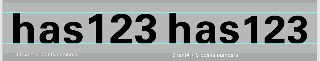
| Fig. 4.3.3 Font size reduction to match serif typeface |
In Fig. 4.3.3, the sans serif font (Univers) has been reduced by .5 to match the x-height of the serif typeface. 8 ≠ 7.5
|
| Fig. 4.3.4 Font size reduction of numerical characters |
Reducing aligned figures (numbers) or All Capital acronyms embedded in text by .5 can ensure visual cohesion of the text.
*This step is because numerical characters has the same height as capital letters. Some typographers would prefer slightly smaller numerical characters.

|
| Fig. 4.3.5 Readability of unaligned text vs aligned text |
When highlighting text by placing a field of colour at the back of the text, maintaining the left reading axis of the text ensures readability is at its best, as shown in Fig. 4.3.5.

|
| Fig. 4.3.6 Weaker reading axis vs strong reading axis |

|
| Fig. 4.3.7 Indented quote vs extended quote |
Quotation marks, such as bullet points, can create a clear indent, breaking the left reading axis. A clear comparison can be seen between the indented quote at the top with the extended quote at the bottom of Fig. 4.3.7.

|
| Fig. 4.3.8 Prime vs quote symbols |
*A prime is not a quote. The prime is an abbreviation for inches and feet. Due to the limited number of keys on a typewriter, they were substituted. The were later known as ‘dumb quotes’. When used as quotes today in typesetting they aren't just dumb but criminal.
4. Headline with text
There are many kinds of subdivision within text of a chapters, which are designed according to the level of importance.
*Always remember, a typographers task is to make sure these heads clearly signify to the reader the relative importance within the text and to their relationship to each other.

|
| Fig. 4.4.1 A aka Main heading |
A head indicates a clear break between the topics within a section. In Fig. 4.4.1, ‘A’ heads are set larger than the text, in small caps and in bold. The fourth example shows an A head ‘extended’ to the left of the text.

|
| Fig. 4.4.2 B aka Subheading |
B head < A heads. B heads indicate a new supporting argument or example for the topic at hand. As such they should not interrupt the text as strongly as A heads do. Above are B heads shown in small caps, italic, bold serif, and bold san serif.

|
| Fig. 4.4.3 C aka 'Sub-subheading' |
The C heads, although uncommon, highlights specific facets of material within B head text. They do not interrupt the flow of reading. Similarly to B heads, C heads can be shown in small caps, italics, serif bold and san serif bold. C heads in this configuration are followed by at least an em space for visual separation.

|
| Fig. 4.4.4 Hierarchy |
Putting together a sequence of subheads enables visual hierarchy. However, there is no single way to express hierarchy within text; in fact the possibilities are infinite.
5. Cross alignment

|
| Fig. 4.5.1 Cross alignment with smaller side text |

|
| Fig. 4.5.2 Cross alignment with headline and sub headline |
Another example is shown her in Fig. 4.5.2, one line of headline type cross-aligns with two lines of text type, and (right; bottom left) four lines of headline type cross-align with five lines of text type.
INSTRUCTIONS
MIB:
Task 1 - Exercise - Type Expression
Week 1 - Sketch

|
| Fig. 1.1 Initial sketches, Week 1 (30/03/2022) |
For this exercise, we are going to design a word-based image using a word that brings out the meaning of the word itself. I tried to include very little graphic/drawing, as we were told to tale more of a word-based approach when designing. While I was sketching, I try and visualize what each of the word mean in real life, and tried to put the visuals in my sketches using as little drawings as possible.

|
| Fig. 1.2 'Cough' selected sketch, Week 1 (30/03/2022) |

|
|
Fig. 1.3 'Explode' selected sketch, Week 1 (30/03/2022) |

|
|
Fig. 1.4 'Pop' selected sketch, Week 1 (30/03/2022) |

|
|
Fig. 1.5 'Squeeze' selected sketch, Week 1 (30/03/2022) |
Week 2 - Digitalization

|
| Fig. 2.1 Cough initial designs, Week 2 (06/04/2022) |

|
| Fig. 2.2 Pop initial designs, Week 2 (06/04/2022) |

|
| Fig. 2.3 Explode initial designs, Week 2 (06/04/2022) |

|
| Fig. 2.4 Squeeze initial designs, Week 2 (06/04/2022) |
I have created 4 different designs for each of the 4 words: Cough, Pop, Explode, and Explode. I tried out different typefaces, different letterforms, and different arrangements.

|
| Fig. 2.5 Initial final type expression, Week 2 (06/04/2022) |
These are the designs I chose for each word:
Cough - I like the typeface as it looks more lively than the others. The different opacity of the 'ough!'s also makes the design less simplistic.
Pop - In my opinion, the Gill Sans Std Shadowed typeface suits the word well and makes it look less flat and more three-dimensional.
Explode - I chose this design because this arrangement allows a focus to be present -- 'PLO'. The other designs look too common to me.
Squeeze - The selected one looks the most balanced among the four designs. In addition to that, the condensed typeface also portrays the word 'squeeze' well.
Post feedback changes:

|
| Fig. 2.6 Post feedback designs for 'Cough!', Week 3 (13/04/2022) |
Final Outcome - Text Expression

|
| Fig. 2.7 Final text expression design, Week 3 (13/04/2022) |
PDF File
Week 3 - GIF Animation
|
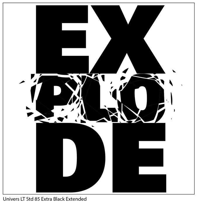
| Fig. 3.1 Final decision 'EXPLODE', Week 3 (13/04/2022) |
After digitizing all four designs, I decided to move on to animate the word 'EXPLODE'. I think it looks the most interesting among the four, and I really like the shattering effect. I know it might take up more time trying to smoothen the shatter, but I'd like to take up this challenge.
This design also shows the principle of designs. For example, The shattering on the PLO and not all the letters shows emphasis. This is so that the viewer knows where the main focus at and where to look at when the GIF is playing.

|
| Fig.3.2 Frames for animation (left-right, top-bottom), Week 3 (13/04.2022) |
Concept: There are 20 frames altogether. My idea for this GIF animation is to portray what happens before, during, and after an explosion. During the pre-explosion stage, all the letters are all in tact. As the explosion starts, the letters P, L, and O start to crack, When they explosion reaches the maximum point, I tried to create a flashing effect just like in a real explosion. I do this by reducing the opacity of every frame gradually (100%, 80%, 50%, 25%, 10%, 0%). After the flash, the remaining letters slowly appear but PLO has perished.
After finishing designing all frames in Illustrator, I imported the frames into Photoshop to start the animating process.
Final Outcome - GIF

|
|
Fig. 3.3 Final GIF 'EXPLODE', Week 3 (13/04/2022) |
Task 1 - Exercise 2 - Text Formatting
Week 4 - Type Formatting
Lecture 1/4 of Text Formatting: Kerning and Tracking

|
| Fig. 4.1 All 10 type families, Week 4 (20/04/2022) |

|
|
Fig. 4.2 Selected specific typeface for each type family (e.g. bold,
semi bold, oblique, etc.), Week 4 (20/04/2022) |
Before and after kerning & tracking
Adobe Caslon Pro Semibold

|
| Fig. 4.3 Adobe Caslon Pro (before), Week 4 (20/04/2022) |

|
| Fig. 4.4 Adobe Caslon Pro (after), Week 4 (20/04/2022) |

|
| Fig. 4.5 Bembo Std (before), Week 4 (20/04/2022) |

|
| Fig. 4.6 Bembo Std (after), Week 4 (20/04/2022) |
To create the small capitals look for this particular typeface, I decreased the font size of the letters that I want to make into small capitals. As for the remaining letters (W, J, and Z), I remained the font size and set them to semibold. This way, the width of each letter looks more consistent.
Bodoni Std Bold Condensed

|
| Fig. 4.7 Bodoni Std (before), Week 4 (20/04/2022) |

|
| Fig. 4.8 Bodoni Std (after), Week 4 (20/04/2022) |
Futura Std Light

|
| Fig. 4.9 Futura Std (before), Week 4 (20/04/2022) |

|
| Fig. 4.10 Futura Std (after), Week 4 (20/04/2022) |
Gill Sans Std Bold Extra Condensed

|
| Fig. 4.11 Gill Sans Std (before), Week 4 (20/04/2022) |

|
|
Fig. 4.12 Gill Sans Std (after), Week 4 (20/04/2022) |
ITC Garamond Std Ultra Condensed Italic

|
|
Fig. 4.13 ITC Garamond Std (before), Week 4 (20/04/2022) |

|
|
Fig. 4.14 ITC Garamond Std (after), Week 4 (20/04/2022) |
ITC New Baskerville Std Italic

|
|
Fig. 4.15 ITC New Baskerville Std (before), Week 4 (20/04/2022) |

|
|
Fig. 4.16 ITC New Baskerville Std (after), Week 4 (20/04/2022) |
Janson Text LT Std 76 Bold Italic

|
|
Fig. 4.17 Janson Text LT Std (before), Week 4 (20/04/2022) |

|
|
Fig. 4.18 Janson Text LT Std (after), Week 4 (20/04/2022) |
Serifa Std 55 Roman

|
|
Fig. 4.19 Serifa Std (before), Week 4 (20/04/2022) |

|
|
Fig. 4.20 Serifa Std (after), Week 4 (20/04/2022) |
Univers LT Std 85 Extra Black

|
|
Fig. 4.21 Univers LT Std (before), Week 4 (20/04/2022) |

|
|
Fig. 4.22 Univers LT Std (after), Week 4 (20/04/2022) |
Combined

|
|
Fig. 4.23 Combined (before), Week 4 (20/04/2022) |

|
|
Fig. 4.24 Combined (after), Week 4 (20/04/2022) |
In Fig. 4.24, I decided to give the design a cleaner look by arranging from the lines with the longest length to the shortest. In addition, I included the specific typeface I used for each line at the right side of the page.
Kerning and Tracking exercise

|
| Fig. 4.25 Final Outcome, Week 4 (21/04/2022) |
Lecture 2/4 - 4/4 of Text Formatting

|
| Fig. 4.26 Important points to look out for, Week 4 (21/04/2022) |

|
| Fig. 4.27 Add new page with above margins and column settings, Week 4 (24/04/2022) |

|
|
Fig. 4.28 Font settings, Week 4 (24/04/2022) |

|
|
Fig. 4.29 Number of characters in the longest line, Week 4
(24/04/2022) |
*Fig. 4.29 came out blurry, but I made sure the number of characters is around 60 characters.

|
| Fig. 4.30 Insert image, Week 4 (24/04/2022) |

|
| Fig. 4.31 Move text to right column, Week 4 (24/04/2022) |

|
| Fig. 4.32 Hyphenate off, Week 4 (24/04/2022) |
|
| Fig. 4.33 After kerning and tracking, Week 4 (24/04/2022) |

|
| Fig. 4.34 Swapped columns and adjusted length of texts, Week 4 (24/04/2022) |

|
| Fig. 4.35 Widows spotted, Week 4 (24/04/2022) |

|
| Fig. 4.35 Widows issue fixed by using force line break, Week 4 (24/04/2022) |

|
| Fig. 4.36 Arrangements of heading, subheading, body text, and images, Week 4 (24/04/2022) |

|
| Fig. 4.37 Ensure cross alignment, Week 4 (24/04/2022) |
Pre- Compositions

|
| Fig. 4.38 Pre-composition 1, Week 4 (24/04/2022) |

|
|
Fig. 4.39 Pre-composition 2, Week 4 (24/04/2022) |

|
|
Fig. 4.40 Pre-composition 3, Week 4 (24/04/2022) |
I came up with these 3 pre-compositions to experiment with different placements of elements in the page. This is so that I have a selection of designs to choose from to become my final design.
(Initial) Final Outcome: Text Formatting

|
| Fig. 4.41 (Initial) Final Outcome, Week 4 (24/04/2022) |
Post feedback changes:
Second paragraph (before vs after)
 |
| Fig. 4.42 Second paragraph (before) |
 |
| Fig. 4.42 Second paragraph (after) |
Forth paragraph (before vs after)
 |
| Fig. 4.43 Forth paragraph (before) |
 |
| Fig. 4.44 Forth paragraph (after) |
Final Outcome - Type Formatting
%20IMPROVED.jpg) |
| Fig. 4.45 Final Outcome - Type Formatting, Week 5 (27/04/2022) |
 |
| Fig. 4.45 Final Outcome with baseline grids, Week 5 (27/04/2022) |
I moved the heading and body text around in the page and adjusted some of the letterspacing within the body texts. I also rearranged the images and aligned then with the left column. In my opinion, it looks more consistent and uniform after the changes.
Details
PDF Files
FEEDBACK
Week 2 - Exercise - Type expression sketches
Questions to ask myself:
2. Does the expression match the meaning of the word?
3. On a scale of 1–5, how strong is the idea?
4. How can the work be improved?
General feedback: Overall, very clean sketches.
Specific feedback: Mr Vinod gave his opinions on my sketches and these are the best ones for each of the words. He emphasized on my sketch for "Squeeze" and would like to see how I am able to create the kind of distortion in my final design.
Week 3 - Exercise - Text expression digitization
General Feedback: I produced four different designs for each of the words, and it is up yo me to select which of the four designs I want to choose as the final designs. Overall, good job.
Specific Feedback: As for 'Cough!', a symmetrical design would be better, as it will look more balanced. Also, think about optical centralization (might want to move the design to the left, if the objects on the right have more weight to it.
Week 4 - E-portfolio submission
General Feedback: E-portfolio should be well organized and ready for submission by next week.
Specific Feedback: Make sure to label images including the week and date. Information should be arranged with a sense of hierarchy in mind.
Week 5 - Exercise - Type formatting + Final comments before submission
General Feedback: E-portfolio is well colour coded with a sense of hierarchy. The 'Kerning and Tracking' exercise is not required to be placed under Final Outcome. Some texts look justified and some ragged right, might want to fix it. A JPEG image of the final outcome with baseline grids should be added.
Specific Feedback:
 |
| Fig. i Feedback, Week 5 (27/04/2022) |
Heading is aligned to the right while body is left aligned. This may make the entirety of the page look less uniform. Mr Vinod suggested that it would look better to move the body text in the left column up until the margin edge, and move the heading to the right column, where the upper red rectangle is. As for the images, it would be nice to align them towards the left along the body texts, where the bottom red rectangle is.
The letterspacing for the second paragraph looks 'too neat' or 'too justified-like' compared to the other paragraphs. This might interfere with the consistency of the text. Adjust the letterspacing of the second paragraph to give it more rag.
In the first line of the forth paragraph, the word 'German' was protruding too much. It is not advisable to have such long line as the first line of a paragraph.
REFLECTION
Experience
At the beginning, I struggled a little bit when trying to come up with original ideas. I had zero experience working with only text, especially the limited 10 typefaces and restrictive use of graphical elements. I eventually find my way through and created designs that I am satisfied with. I also had the chance to familiarize myself in Adobe Illustrator, Photoshop as I complete my work for Exercise 1.
As for the second exercise, it was a brand new experience to me. This is the first time I've used InDesign and was initially clueless about how things work. However, after watching the lecture and tutorial videos, I have a better understanding about it. Although I understand the technical part of things, implementing them to create a visually appealing design is quite challenging. I experimented with different compositions so I have a range of selections to choose from.
Overall, I have learnt a lot about type expression and test formatting through this experience.
Observation
Findings
I have discovered a lot of new functions, tools, keyboard shortcuts that I have never used before. Besides, an excellent typeface can only be produced through decades and even centuries of careful thinking and modifications. A good thought process leads to a good end product.
In addition, when it comes to formatting text in a page, the layout would look the best if most of the elements aligns with each other. This shows the uniformity of the layout. However, appropriately tweaking and making small amounts of text not align with other texts can show contrast.
FURTHER READING
A Type Primer, 2nd Edition

|
| Fig. ii Cover page of A type Primer by John Kane, 2nd Edition |
1. Display typefaces

|
| Fig. iii Display Typefaces (Page 14) |
In this page, the author included some display typefaces. Display typefaces are intended to be used at large sizes for headings, rather than for extended passages of body text. They are usually designed in a more decorative manner, rather than a simple and restricted manner used for body text.
In my opinion, these display typefaces make good logos and brand names because of their decorative nature. The typographers who created these displays typefaces specifically designed them to be focused on the aesthetics of the typeface, rather than the readability. One reason of why display texts are used only on brand names, logos, and occasionally on headings, is because they are very short texts. Unlike body texts of long paragraphs in books or articles, they are usually larger in size, which is what provides the readability to the viewer.
 |
| Fig. iv Examples of display typefaces |
In Fig. iv, we can see three well-known logos of big brands. These logos make use of display typefaces to show the uniqueness of their brand.
2. Form / counterform
 |
| Fig. v Form / counterform |
"Just as important as recognizing specific letterforms is developing a sensitivity to the counterform (or counter)-the space described, and often contained, by the strokes of the form. When letters are joined to form words, the counterform includes the spaces between them. The latter is a particularly important concept when working with letter forms like the lowercase 'r' that have no counters per se. How well you handle the counters when type determines how well words you set hang together-in other words, how easily we can read what's been set."
From what I understand, the form of a letter basically refers to the positive areas of the letter; whereas. the counterform refers to the negative spaces.
In my opinion, effectively study and use counterforms may create interesting designs. By showing only the negative spaces, our human eyes are able to identify what letter it is. Although it does not show the whole word explicitly, we can obviously see the word 'creams' in Fig. v.
 |
| Fig. vi More examples |
 |
| Fig. vii Design created using forms and counterforms |
Above are two more images I found online to improve my understanding on how we can use them to create unique looking designs. According to my observation, the design in Fig. vii also uses the element of figure & ground. The artist mixed and matched forms and counterforms to create this very abstract like design. Fascinating.


Comments
Post a Comment