Digital Photography and Imaging Task 1 - Project 1
WONG JUN ZHE / 0353613
Digital Photography and Imaging / B' Creative Media / Taylor's University
Task 1 - Project 1 (Exercises 1 & 2)

LECTURES
Week 1
We covered a little bit about the origin of photograph manipulation, and how it evolved over time, which eventually turns into digital imaging aka Photoshop.
Week 1 - Lecture 1: Introduction to Digital Photography and Imaging
1. The importance of Photoshop for the Graphic Designer:
- Express your creativity
- Create graphic design
- Restoration of old images
- Integrate graphics and text artistically
- Make use of brushes
- Change photo colour
- Rectify mistakes in photographs
Photograph manipulation: The transformation or alteration of a photograph using various methods and techniques to achieve desired results.
Digital Imaging: Digital imaging converts printed text, artwork, and photographs into digital images using a digital scanner or another imaging device.

|
| Fig. 1 Techniques and Purpose of Photo Imaging |
Fig. 1 shows four useful techniques of digital imaging and their purpose.
2. Top 10 Tips to become a Successful Graphic Designer
- Follow the tutorials
- Experiment
- Memorize all keyboard shortcuts
- Try to replicate others' work
- Do participate in design competitions
- Subscribe to online galleries
- Smart objects for smart designers
- Scaling artworks and proportions
- Use actions to personalize work
- Organize Files Properly
Week 2 - Lecture 2
1. Introduction to basic composition

|
| Fig. x Focal point, sequence of seeing |
Focal point: Helps the viewers’ eyes naturally settle on the important pieces of your design first.

|
| Fig. x Scale and Hierarchy, sequence of seeing |
Scale and Hierarchy: Scale is often used to help communicate hierarchy by drawing attention toward and away from certain elements, thus signifying their importance to the communication.
*Eye contact always attract the viewer's attention first.

|
| Fig. x Balance the elements, sequence of seeing |
Balance the elements: Think of each element as having a ‘weight’ to it. Smaller objects might ‘weigh’ less than larger objects, and heavily textured elements might ‘weigh’ more than flatly colored elements.

|
| Fig. x White space, sequence of seeing |
White space (aka "empty space"): Help boost your design’s clarity and overall look by balancing out the more complicated and busy parts of your composition with space that helps your design to breathe.
2. Rule of thirds

|
| Fig. x Rule of Thirds |

|
| Fig. x Example of a photo taken using the Rule of Thirds |
Rule of Thirds: The process of dividing an image into thirds, using two horizontal and two vertical lines. This imaginary grid yields nine parts with four intersection points.
Intersection points: When important elements of an image is placed on the four interception points, a much more natural image will be produced.
Placement of the horizon: It is suggested that any horizon is placed on either the top horizontal line or bottom horizontal line.

|
| Fig. x Percentages of how much an object dominates each intersection points |

|
| Fig. x Cyclist as the focal point |
Interestingly, objects on the left side of the design tend to attract the viewer's attention first, according to a finding of the western culture. People have the habit to look from left to right, top to bottom. In the second photo, majority of people would immediately be attracted to the cyclist because of this.
The Rule of Thirds is a way to:
- Use composition techniques that are in line with what’s naturally pleasing to the eye.
- Creatively use negative space.
- Create conversation between the subject and background.
3. Golden ratio

|
| Fig. x The Golden Ratio |

|
| Fig. x The Golden Ratio in nature |
The Golden Ratio: The Golden Ratio is a mathematical ratio and can be commonly found in nature. When applied in a design, it allows organic and natural-looking compositions that are aesthetically pleasing to the eye.

|
| Fig. x Application in design 1 |

|
| Fig. x Application in design 2 |
Application in design: In design, the Golden Ratio boils down to aesthetics — creating and appreciating a sense of beauty through harmony and proportion. When applied to design, the Golden Ratio provides a sense of artistry
Week 3 - Lecture 3 - Introduction to Photoshop 2

|
| Fig. x Lecture exercise, Week 3 (14/04/2022) |
This topic is about selection and layering. In class, we tried out to select and mask layers using the lasso tools. Then we copied the masked layers into another image.
Layer interface

|
| Fig. x Layer interface |
Tool box

|
| Fig. x Tool box |
Photoshop provides several tool sets in the Toolbox, and you can expand the tool sets to reveal additional tools.
Marquee Selection Tools

|
| Fig. x Marquee Selection Tools |
1. Lasso tool

|
| Fig. x Three types of Lasso tools |
The Lasso Tool allow you to draw and pinpoint specific areas of a document. When we click on the Lasso tool on the toolbar, three types of lasso tools can be seen: Lasso, Polygonal Lasso, and Magnetic Lasso.
2. Pen tool

|
| Fig. x 'Anatomy' of the pen tool |
*The fewer number of points, the smoother the path will be.
Variations of he pen tool

|
| Fig. x Straight line path |

|
| Fig. x U-shaped curve |

|
| Fig. x Simple S curve |

|
| Fig. x Complex S curve |
3. Lasso vs Pen tool
The pen tool is a versatile tool in Photoshop that can be used to create extremely precise shapes and paths, using manually placed anchor points. Although commonly used to make selections, the pen tool was not natively made as a “selection tool”
4. Layering
Layers are different images stacked on top of each other. Each layer are used without affecting another one to make adjustments. Together these layers form one final image. It could look something like this in real life.
The advantage of using Layers is that you can save a Photoshop file while having all the layers included. This means you can use layers for non-destructive editing. Any adjustments made in Photoshop will never destroy the original image. The layers contain all the extra information and / or images you want to add to the original file.
Week 4 - Lecture 4 - Introduction to Photoshop 3
1. Adjustment layer

|
| Fig. x Adjustment layer |
The adjustment layers allows editing and discarding adjustments or restoring the original image at any time. This will make one's workflow in Photoshop more flexible and efficient, and is an absolute must-know.

|
| Fig. x Some basics of the adjustment layer |
When an adjustment layer is added to an image, a new layer will appear over the image and a Properties panel specific to the type of adjustment selected will pop up. The Properties panel allows modification of the adjustment layer, which in turn will modify the image.
i. Brightness / Contrast

|
| Fig. x Brightness / Contrast |
Brightness / Contrast makes adjustments to the tonal range of your image.
The brightness slider is for adjusting the highlights in an image and the Contrast slider is for adjusting the shadows in an image.
ii. Levels

|
| Fig. x Levels |
Levels modify the tonal values in an image by adjusting the levels of the shadows, midtones, and highlights.
It’s one of the most useful tools in the adjustment layer panel, and using just a touch of levels will go a long way in correcting your images.
iii. Curves

|
| Fig. x Curves |
Curves allows adjustments of as many points as one wants throughout the entire tonal range of image, and is the most powerful and precise tool for editing the tones in an image.
iv. Exposure

|
| Fig. x Exposure |
Exposure allows adjustments of the exposure levels with three sliders: Exposure, Offset and Gamma.
Exposure will adjust only the highlights of the image, Offset adjusts the mid tones and Gamma will adjust the dark tones only.
v. Selective Colour

|
| Fig. x Selective Colour |
The Selective Color adjustment layer selectively modifies the amount of a primary color without modifying the other primary colors in your image.
2. Filters

|
| Fig. x Filters |
Using filters to edit photos is an essential element of Adobe’s graphics editor.
There are filters to change colour, add blur or create completely new image effects. Photoshop offers a virtually unlimited variety of filters for this purpose.
3. Exercise
In this exercise, I am required to select and mask Shazam from its poster. Then, take the masked image of Shazam and insert into a background image of the Hearst mansion.

|
| Fig. x Hearst mansion |

|
| Fig. x SHAZAM! poster |
Process
1. Shazam

|
| Fig. x Step 1: Selection of Shazam, Week 4 (21/04/2022) |
Step 1: Using the object selection tool and the quick selection tool, I carefully selected Shazam from the poster. Then I clicked on the Add vector mask button.

|
| Fig. x Step 2: Solid colour added, Week 4 (21/04/2022) |
Step 2: Added a new layer underneath the masked layer. In that layer, I clicked on Create new fill and adjustment layer > Solid colour. For that, I chose a blueish grey hue.

|
| Fig. x Step 3: Hue/Saturation adjustment layer added, Week 4 (21/04/2022) |
Step 3: Create new fill and adjustment layer > Hue/Saturation. Then, I played around with the sliders a bit to produce this result.
2. Editing Shazam into Hearst mansion

|
| Fig. x Steps 1 & 2: Matched colour & added noise, Week 4 (21/04/2022) |
Step 1: The goal of this exercise is to make Shazam look real in the mansion setting. First, I went to Image > Adjustments > Match colour to match the colour of Shazam to the background.
Step 2: Added noise to Shazam, Filter > Noise > Add noise.

|
| Fig. x Step 4: Shadow with gaussian blur added at 66% opacity, Week 4 (21/04/2022) |
Step 3: Add shadow using the Brush tool. Added Gaussian blur to the shadow, Filter > Blur > Gaussian blur. Change opacity of shadow to 66%.

|
| Fig. x Steps 4 & 5: Reflection, Week 4 (21/04/2022) |
Step 4: To add reflection, reflect the image vertically. Perfect selection using Polygonal lasso tool.
Step 5: Match colour of reflection with pool. Added ripple effect, Filter > Distort > Ripple.
Final outcome

|
| Fig. x Digital Imaging Exercise 1, Week 4 (21/04/2022) |
INSTRUCTIONS
MIB:
Week 1
Activity 1: The Bezier Game
Activity 2: List down your 3 favourite graphic design work from Pinterest. Explain why you like the designs?
Design #1:

|
| Fig. 1 Not Another |
Design #2:

|
| Fig. 2 City Lights |
Design #3:

|
| Fig. 3 Skull |
Task 1 - Exercise 1 - Physical collage
Week 2
Process

|
|
Fig. x Cut outs from magazines, Week 2 (07/04/2022) |

|
|
Fig. x Magazines, Week 2 (07/04/2022) |

|
|
Fig. x Types of paper, Week 2 (07/04/2022) |
Tools I use include scissors, cutter, and glue.

|
|
Fig. x Final chosen pieces, Week 2 (07/04/2022) |
When I was about to start composing, I realized that I have too many objects, as I remembered empty space is also as equally important as occupied space. So, I cut down the number of objects and left with the objects above.

|
| Fig. x Physical collage pre-comp 1, Week 2 (07/04/2022) |

|
|
Fig. x Physical collage pre-comp 3, Week 2 (07/04/2022) |
After finishing the second pre-composition, I took a break and went on Pinterest to look at other people's work.

|
|
Fig. x Physical collage pre-comp 3, Week 2 (07/04/2022) |
Then, I came up with the third pre-composition, which is quite different than the previous ones. This one looks messier, and I made the human figures the centre of attraction.
Final Artwork

|
| Fig. x Final physical collage composition, Week 3 (14/04/2022) |
PDF file - Exercise 1 - Physical collage
Task 1 - Exercise 2 - Digital collage
Week 3
|
| Fig. x Digital collage pre-comp 1, Week 3 (14/04/2022) |

|
| Fig. x Digital collage pre-comp 2, Week 3 (14/04/2022) |

|
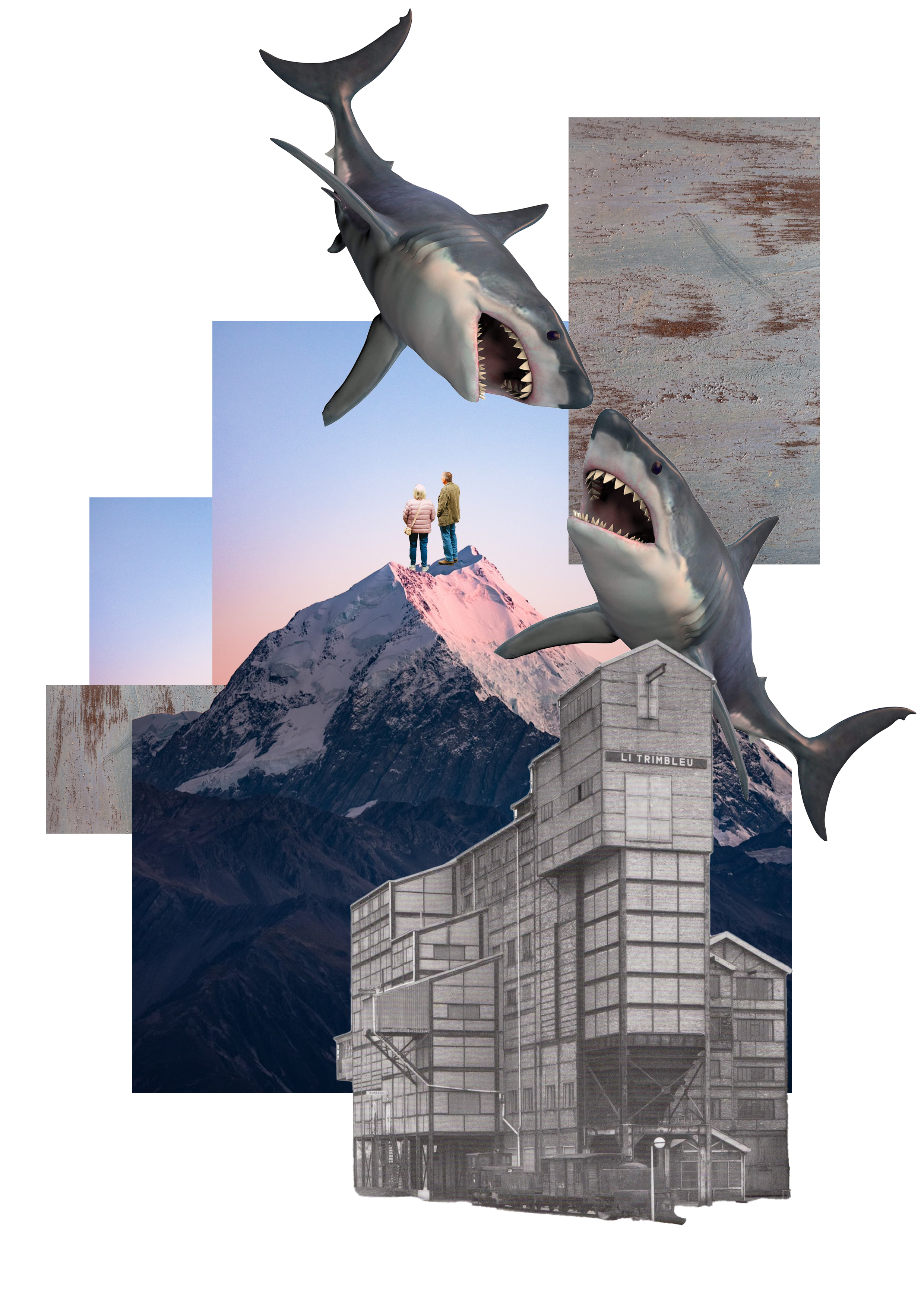
| Fig. x (Chosen) Digital collage pre-comp 3, Week 3 (14/04/2022) |
I had a lot of fun when thinking about ideas for these digital collage compositions and during the hands on experience. Honestly, I was just playing around with different arrangements with the design principles in mind.
For the first pre-composition, I have included elements of emphasis and contrast. Emphasis can be seen through the two people on top of the mountain which is the main focus. The dull/grey coloured objects at the foreground and the brightly coloured background suggests contrast.
For the second pre-composition, I used the element of repetition to create an interesting design. I duplicated the objects and arranged them in a way that looks interesting to me. It kind of has the 'glitchy' effect.
As for the third pre-composition, I played around with inverted colours and reflections, which creates a mirror-like effect. Emphasis can also be seen here with the two fencers at the centre of the design.
Week 4

|
|
Fig. x Improved version of my digital collage composition,
Week 5 (28/04/2022) (replacement for week 4) |
Final Outcome - Digital collage
|
|
|
Fig. x Final digital collage, Week 5 (28/04/2022) |
PDF File - Exercise 2 - Digital collage
REFLECTION
Experience
As for the digital collage I did in Photoshop, most of the time I was just playing around with the objects and their placements. There are infinite numbers of possible compositions I am able to effectively select and remove the backgrounds of each object from their original image using the various selection and lasso tools.
Observation
Throughout this project, I have observed that I was learning when playing and messing around with various objects to come up with a final composition.
Findings
By arranging the pieces/objects into a composition in both the physical and digital collage, I have discovered that producing a good composition is not as easy as I think. Though the technical part of things were manageable for me, the true challenge is when thinking about the best way of designing. In my opinion, this will only come with patience, time, practice, and experience.
Besides, throughout this project, I am able to further sharpen my skills of using Photoshop (e.g. shortcut keys, tool, etc.), as well as my understand in composition study.
Oh yeah, I've also discovered that accidents can be beautiful sometimes, in design. I have made tiny accidents while completing this project and some of them turned out looking good.
FEEDBACK
Task 1 - Exercise 1 - Physical collage
Week 2 (07/04/2022)
General feedback: After completing the first collage, take a break and see how good designers compose their artworks on Pinterest. Search for new ideas.
Specific feedback: Mr Martin commented that the first composition is very neat.
Week 2 (07/04/2022)
General feedback: 'Do you have OCD?', Mr Martin asked, as the first pre-comp looks too neat. All three pre-compositions are quite different, but the second and third are the more interesting ones in terms of composition wise.
Specific feedback: The second one looks slightly more interesting than the third. The way the images are arranged make the eyes mingle around the plane more, especially with the arrows. Go for composition 2.
Week 4 (21/04/2022)
General feedback: The first pre-composition looks the best. Definitely go for the first one.
Specific feedback: The first pre-composition shows clear foreground, middle ground, and background, which makes the composition looks much more interesting. The first and second compositions look quite simple in contrast with the first one. They look like they can be done within minutes.


Comments
Post a Comment