Illustration & Visual Narrative Task 1 - Exercises
WONG JUN ZHE / 0353613
Illustration & Visual Narrative / B' Creative Media / Taylor's University
Task 1 - Task1 (Exercises 1 & 2)

LECTURES
Week 1 (31/03/2022) - Lecture 1: Introduction to module
Week 2 (08/04/2022) - Lecture 2: Character design basics
Lecture report 1 - Visual study of a character

|
| Fig. L.2 Dr. Heinz Doofenshmirtz |
Character chosen: Dr. Heinz Doofenshmirtz
Dr. Heinz Doofenshmirtz is the main antagonist in the cartoon entitled Phineas and Ferb. Phineas and Ferb are brothers who go on various bizarre adventures during their summer vacation, while trying to keep their sister from interfering with their plans.
I chose a character from this animated series as it was part of my childhood.
He was a friendly and nice guy during his early days, unlike the evil him now. When he was a boy, Doof was put in many situations where everything was against him. One of the many examples is the lack of proper parenting. At Heinz's birth, neither of his parents "showed up"; his parents favoured his brother more; his parents regularly yells at him for making tiny mistakes; and many more. He also experienced an uneasy school life. One of which is that he never won the science fair competitions in his school despite his outstanding inventions. Overall, he had an uneasy and unfortunate childhood.
As for his design, Dr. Doof wears black inner clothes with a white lab coat on, which shows that he's a scientist. He wears a pair of green trousers, which I find interesting. The green colour gives out a sense of friendliness. This suggests that deep down his heart, he wants to be a kind and nice person. It's just that those emotions are overwhelmed by the trauma from the past, which ultimately made him evil. Other than that, his facial expressions, especially his slanted eyebrows, which give him more of the sinister look. Overall, he looks very angular and edgy. His head is basically based on a triangular shape, which is a typical element used by character designers to create a villain. His long and tangly fingers are also reflects on his evil personality well. Another element that the artist put into his design is the hunched back, which made him look even more evil.
In conclusion, I think Dr. Doof is a good example of a simple but meaningful design.
Week 3 (15/04/2022) - Chiaroscuro
Lecture report 2 - Chiaroscuro analysis

|
| Fig. L.3.1 End of second boss fight (Sifu), Week 3 (15/04/2022) |

|
| Fig. L.3.2 Pendant that revives |
'Sifu' (translates to 'Master') is an action beat em' up video game developed and published by French company Sloclap. The game is set in modern-day China, where a child of a martial arts school's sifu seeks revenge on a group consisting of five members, who are responsible for their father's death.
After killing the child's father, Yang, the leader of the group, ordered his comrade to kill the child by slashing into the child's neck with a machete. However, the attempt failed. The child mysteriously wakes up with a bright, glowing pendant in his hand; no marks of damage on their neck; like nothing happened. The game then skipped till the main character was twenty-years-old. In these years, he focused on training and mastering Bak Mei (a style of Kung Fu), with the ultimate goal of defeating all five members of the group.
The scene shown in Fig. x shows the moment where the main character is about to finish one of the group members, Sean. At first glance, the use of chiaroscuro makes the frame very dynamic. The frame looks brighter on the left and darker towards the right. This is to illustrate the kind of heroic vibe of the main character, as opposed to Sean's evilness.
In this frame, we can clearly identify the primary element and the secondary elements with the use of light and dark to highlight/blur different parts of the frame. A bright light shines from above/behind the main character, which creates a very noticeable contrast between light and dark. Therefore, it emphasizes on the main character to make it stand out, even though there is nothing special about its design.
On the other hand, Sean, an antagonist of the video game, is lying down in the foreground. Besides the darker lighting at the villain's end, the figure is also being blurred out so that the viewer pays more attention to the focal point itself. Although Sean dominates the foreground, the use of lower lighting and the blur-out technique can really turn the viewer's attention towards the main character.
Week 4 (20/04/2022)

|
| Fig. L.4.1 Pears exercise |
Lecture report 3 - 6 types of compositions
 |
| Fig. L.4.2 Bird's eye view |
 |
| Fig. L.4.3 Close up |
 |
| Fig. L.4.4 Establishing |
 |
| Fig. L.4.5 Frame within a frame |
 |
| Fig. L.4.6 Medium shot |
 |
| Fig. L.4.7 Worm's eye view |
Week 5 (29/04/2022)

Fig. L.5.1 Outlines

Fig. L.5.2 Chiaroscuro exercise
|
| Fig. L.5.1 Outlines |

|
| Fig. L.5.2 Chiaroscuro exercise |
Lecture report 4 - Analysis of scene: foreground, middleground, and background
Media selected: Arcane (TV series)

Fig. L.5.3 S1 E2

Fig. L.5.4 S1 E7

Fig. L.5.5 S1 E8

Fig. L.5.6 S1 E2 with indicator
*Blue: Foreground; Orange: Middleground; Green: Background
Design principles:
Rule of thirds - The people in the image are place accordingly to the
rule of thirds, which makes the frame more visually appealing and puts
more emphasis on them.
Contrast - Contrast of colours can be seen between the foreground and
the background. The foreground has more vibrant colours; whereas, the
background is relatively dull.
Effect on the narratives:
In this scene, an extraordinary man with magical powers can be seen
holding his staff. Using his magical powers, he was able to turn the
season from a blizzarding winter to the very nice season as seen in
Fig. x. He did this because a victim of the blizzard was dying due to
the extreme temperature.
In addition, the way this frame is being designed shows a wide picture
of the environment. This helps to create a sense of atmosphere towards
the viewer.

Fig. L.5.7 S1 E7 with indicator
*Blue: Foreground; Orange: Middleground; Green: Background
Design principles:
Emphasis: Clear emphasis on 'Jinx', one of the main characters in this
TV series.
Hierarchy: Although the stopwatch is being swung at the foreground and
takes up much space, it is a secondary element in the frame as it has
been slightly blurred. The main focus is Jinx because of how she is
positioned in the frame. Then the dull background is even more
insignificant.
Effect on the narratives:
This scene is shot in a unique and interesting angle, where Ekko and
Jinx are about to battle. The stopwatch was being swung by Ekko, one
of Jinx's childhood friends. He has the ability to use the stopwatch
to calculate her moves and how to win the battle. The implicit
meaning, in my opinion, is that Ekko is hesitating to fight his
childhood friend.

Fig. L.5.8 S1 E8 with indicator
*Blue: Foreground; Orange: Middleground; Green: Background
Design principles:
Movement: Movement can be shown when Vi, a main character, punches an
enemy towards the sky. The dynamic pose of Vi and the enemy shows
clear movement and the viewer is able to understand easily.
Emphasis + Contrast: The main emphasis of this frame is Vi. This is
achieved by using accent colours of blue and purple, which contrasts
with the rest of the frame. The rest of the frame is mostly dul grey
and green.
Rule of thirds: Vi, the main focus is positioned according to the rule
of thirds. making the scene even more visually appealing.
Effect on the narratives:
Vi punches a Chemtank enemy up to the skies, as another one of them
approaches from behind her.

|
| Fig. L.5.3 S1 E2 |

|
|
Fig. L.5.4 S1 E7 |

|
|
Fig. L.5.5 S1 E8 |

|
|
Fig. L.5.6 S1 E2 with indicator |
*Blue: Foreground; Orange: Middleground; Green: Background
Design principles:
Rule of thirds - The people in the image are place accordingly to the rule of thirds, which makes the frame more visually appealing and puts more emphasis on them.
Contrast - Contrast of colours can be seen between the foreground and the background. The foreground has more vibrant colours; whereas, the background is relatively dull.
Effect on the narratives:
In this scene, an extraordinary man with magical powers can be seen holding his staff. Using his magical powers, he was able to turn the season from a blizzarding winter to the very nice season as seen in Fig. x. He did this because a victim of the blizzard was dying due to the extreme temperature.
In addition, the way this frame is being designed shows a wide picture of the environment. This helps to create a sense of atmosphere towards the viewer.

|
| Fig. L.5.7 S1 E7 with indicator |
*Blue: Foreground; Orange: Middleground; Green: Background
Design principles:
Emphasis: Clear emphasis on 'Jinx', one of the main characters in this TV series.
Hierarchy: Although the stopwatch is being swung at the foreground and takes up much space, it is a secondary element in the frame as it has been slightly blurred. The main focus is Jinx because of how she is positioned in the frame. Then the dull background is even more insignificant.
Effect on the narratives:
This scene is shot in a unique and interesting angle, where Ekko and Jinx are about to battle. The stopwatch was being swung by Ekko, one of Jinx's childhood friends. He has the ability to use the stopwatch to calculate her moves and how to win the battle. The implicit meaning, in my opinion, is that Ekko is hesitating to fight his childhood friend.

|
| Fig. L.5.8 S1 E8 with indicator |
*Blue: Foreground; Orange: Middleground; Green: Background
Design principles:
Movement: Movement can be shown when Vi, a main character, punches an enemy towards the sky. The dynamic pose of Vi and the enemy shows clear movement and the viewer is able to understand easily.
Emphasis + Contrast: The main emphasis of this frame is Vi. This is achieved by using accent colours of blue and purple, which contrasts with the rest of the frame. The rest of the frame is mostly dul grey and green.
Rule of thirds: Vi, the main focus is positioned according to the rule of thirds. making the scene even more visually appealing.
Effect on the narratives:
Vi punches a Chemtank enemy up to the skies, as another one of them approaches from behind her.
INSTRUCTIONS
MIB:
Activity: The Bezier Game
Task 1 - Exercise 1 - The Vormator Challenge
Week 2 (08/04/2022)
0. Introduction

|
|
Fig. 1.2.1.1 Shapes for Vormator Challenge |
For this challenge, I would have to push my creativity and imagination to the max, as we are required to create a character using a total of 8 simple shapes as shown above.
1. Tracing the shapes

|
| Fig. 1.2.1.2 Lowered opacity and tracing, Week 2 (08/04/2022) |
To trace the shapes, I lowered the opacity of the original image to 20%, so I can see my outlines better. Then, I started tracing the shapes carefully. Tools I used are the pen tool, rectangular tool, curvature tool, direct selection tool, etc.
Week 3 (15/04/2022)
2. Idea and inspiration
There were a couple of ideas in mind when brainstorming ideas: fallen angel, angelic warrior, and mythical creature. I ended up deciding on creating a mythical creature, with is comparably simpler as I do not want to risk having enough time to finish a character design with quality.

|
| Fig. 1.3.2.1 Reference 1, https://www.pinterest.com/pin/851813717034940322/ |

|
| Fig. 1.3.2.2 Reference 2, https://www.pinterest.com/pin/851813717034940323/ |

|
| Fig. 1.3.2.3 Reference 3, https://www.pinterest.com/pin/851813717034940321/ |

|
| Fig. 1.3.2.4 Reference 4, https://www.pinterest.com/pin/851813717034940319/ |
This character design is influenced by mainly two elements: lion and flames. I wanted to create a mythical-like creature that looks arrogant, gallant, and powerful.
3. Sketch / silhouette of character

|
| Fig. 1.3.3.5 First sketch, Week 3 (15/04/2022) |

|
| Fig. 1.3.3.6 Refining the sketch |

|
| Fig. 1.3.3.7 Final sketch, Week 3 (15/04/2022) |
When I was creating a design for my character, I want it to look unique. The unique part of the character is the huge crescent crown. This crescent crown signifies a king figure, and also makes the design pop.
The sketches are done in Photoshop using the Wacom tablet I have. I prefer doing sketches in Photoshop, where I have the brushes I am most familiar with.
4. Base of character

|
| Fig. 1.3.4.1 Outlines of the head, Week 3 (15/04/2022) |
|
| Fig. 1.3.4.2 Head base, Week 3 (15/04/2022) |
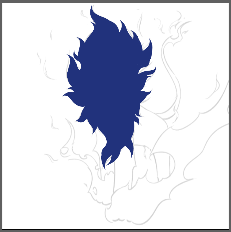
I started off by building the base shape for the head. The vormator shapes I used are 'the tentacle', 'the drop', 'the badge', and 'the bar'. I started of with a solid colour for all parts of the character to just look at the overall shape first.

|
| Fig. 1.3.4.3 Base shapes of the character, Week 3 (15/04/2022) |
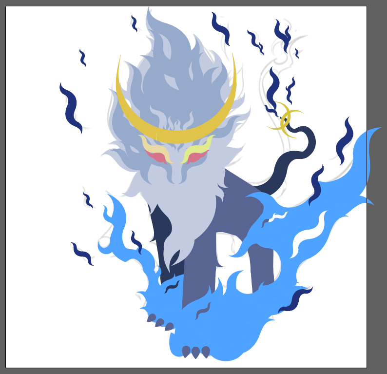
I continued to fill in the shapes for all parts of the character using the shapes as accurately as I can. At this point I have decided the colour scheme that I'll be using: blue, gold, and grey. These colours reflects well with its personality, which is cool, arrogant, and loyal.
Week 4 (22/04/2022)
5. Addition of shadows
|
| Fig. 1.4.5.1 Begin addition of shadows |

|
| Fig. 1.4.5.2 Further progress |
At this stage, I added in more details and shadows, as well as changing the hue of the flames. I chose a lighter and more vibrant colour for it, as I think it fits better than the colour before.
Initial Final

|
| Fig. 1.4.5.3 Initial Final |
I finalized the design by adding more details to it, including shadows, highlights, and altering the design of the tail.
Week 5 (29/04/2022)
6. Post feedback changes
After I receive feedback from Ms Anis, I listened to her suggestions and made the nose and mouth of the character visible. Furthermore, the colour of the eyes has also been changed from white to red/cyan. This will create contrast and make the design more interesting.
%20blue%20eyes-02.jpg)
|
| Fig. 1.5.6.1 (Selected) Experiment 1, post feedback |
%20update-02.jpg)
|
| Fig. 1.5.6.2 Experiment 2, post feedback |

|
| Fig. 1.5.6.3 Outlines |
Final Outcome - The Vormator Challenge
|
|
|
Fig. 1.5.6.4 Final Outcome Character |
Concept
Originating from The Land of Xushea, Leon is the king of his species called the Panteos. Penteos are mythical creatures that emit flames to fight off enemies. What is special about Leon is that he is royalty, which allows his to emit stronger and more deadly blue flames. Leon is a 'pal character' who fights alongside his owner/partner. When tamed, Leon is an extremely trustworthy wingman who would protect his partner till death. Loyalty, bravery, and trust are what he is composed of.
PDF File
Task 1 - Exercise 2 - Trading Card Design
Week 5 (29/04/2022)
0. Introduction
Upon designing my character using the Vormator shapes, I am tasked to create a game/trading card for my character.
1. Idea and inspiration
For the background, I would like to create a scenery of a bamboo forest, which is my character's natural habitat. In my opinion, the character would look pretty nice when paired with a green bamboo forest background. In addition, A simple background would be sufficient as the character is designed to look complicated enough already.

|
| Fig. 2.5.1.1 Bamboo forest Reference 1, https://www.pinterest.com/pin/851813717034940328/ |

|
| Fig. 2.5.1.2 Bamboo forest Reference 2, https://www.pinterest.com/pin/851813717034940325/ |

|
| Fig. 2.5.1.3 Bamboo forest Reference 3, https://www.pinterest.com/pin/851813717034940324/ |

|
| Fig. 2.5.1.4 Bamboo Reference 1, https://studycli.org/chinese-culture/chinese-bamboo/ |

|
|
Fig. 2.5.1.5 Bamboo Reference 2,
https://www.birthday-flowers.net/everything-you-need-to-know-to-shop-for-or-grow-bamboo/ |
2. Bamboo forest process
Firstly, I started off by tracing the shapes that makes up a bamboo stick, as well as the leaves.

|
| Fig. 2.5.2.1 Tracing of bamboo |

|
| Fig.2.5.2.2 Duplicate to make a longer stick |

|
| Fig. 2.5.2.3 Tracing of bamboo leaf 1 |

|
| Fig. 2.5.2.4 Tracing of bamboo leaf 2 |
Next, I put the shapes together to make bamboo sticks and adjusted the size according to how far they are.

|
| Fig. 2.5.2.5 All shapes |

|
| Fig. 2.5.2.6 Added bamboos |

|
| Fig. 2.5.2.7 Bamboos further away |

|
| Fig. 2.5.2.8 Added bamboos in the foreground |
Then, I created a rectangle and applied gradient for the background. This adds more 'flavour' to the design as a whole compared to a single fill.

|
| Fig. 2.5.2.9 Gradient background |

|
| Fig. 2.5.2.10 Altogether |
Lastly, I added a ray of light using a shape I made using the pen tool. I think it really adds the pop to my design.

|
| Fig. 2.5.2.11 Added a ray of light |
3. Overlays (Texts and icons)
This is the icon/logo of Leon. It is shaped like a paw, with sharp claws sticking out. The colours i used for the icon are similar to the character's body colour.
|
|
| Fig. 2.5.3.1 Logo sketch and vector |
I also decided to design some decorative bracket-like icons to be included in the card.

|
| Fig. 2.5.3.2 Bracket thingy sketch |

|
| Fig. 2.5.3.3 Bracket thingy with added shadow |

|
| Fig. 2.5.3.4 Final bracket thingy design 1 |

|
| Fig. 2.5.3.5 Final bracket thingy design 2 |

|
| Fig. 2.5.3.6 Name of character and Tagline |
4. Pre-compositions
After I finish designing all the essential parts for the game/trading card, it is time to assemble them in the best possible composition. I experimented with five different arrangements of the overlays and asked some of my classmates to assist me on making the final decision. We ended up agreeing on the first pre-composition.
%20comp%201-01.jpg)
|
| Fig. 2.5.4.1 (Selected) Pre-composition 1 |

|
| Fig. 2.5.4.2 Pre-composition 2 |

|
| Fig. 2.5.4.3 Pre-composition 3 |

|
| Fig. 2.5.4.4 Pre-composition 4 |

|
| Fig. 2.5.4.5 Pre-composition 5 |
5. Post feedback improvement

|
| Fig. 2.5.5.1 Finishing touches |
Last but not least, I added a soft border around the edges of the card and some shadows underneath my character. According to my observations, I think they help to allow a sense of depth and space.
Final Outcome - Exercise 2 - Card Design

|
| Fig. 2.5.5.1 Final Outcome |
Concept
Originating from The Land of Xushea, Leon is the king of his species called the Panteos. Penteos are mythical creatures that emit flames to fight off enemies. What is special about Leon is that he is royalty, which allows his to emit stronger and more deadly blue flames. Leon is a 'pal character' who fights alongside his owner/partner. When tamed, Leon is an extremely trustworthy wingman who would protect his partner till death. Loyalty, bravery, and trust are what he is composed of.
PDF File
FEEDBACK
Week 1 - 4
General feedback:
(Mr Hafiz) My design of the character is considered very extreme. He also said the sketch of the character looks nice and that I should continue drawing.
Specific feedback: -
Week 5
General feedback:
(Classmates) Regarding the composition for my final design, my classmates gave useful comments on which one I should use and where I could improve on.
Specific feedback:
"I like how the leon is more visible on the top and it is somehow more clean..? It also has the logo or the feet mark on the side that really makes it look like a card"
"Same, for me the 'Leon' is more visible here" (referring to the first pre-comp)
"I think you could also experiment with a dark border? To make the writing more legible. So it doesn't blend too much with the bg"
"Yeaa you're so talented and skilled bro wooowww. Love the details!!"
REFLECTION
In the first exercise, The Vormator challenge, it was very challenging at first. I didn't know what I want the character to be at that point. Once I have decided on designing a mythical creature type of character, I tried to use the Vormator shapes to block out the shapes that make up the character. This also put up quite a challenge at first. However, after attending a couple of lectures and tutorials, I have learnt useful tools to make my life easier, especially the pathfinder tools. In conclusion, I would say that I am able to use simple shapes to produce a design. This is important because there are times we overcomplicate things, and looking at things using simple shapes might be the best solution.
As for the second exercise, where I am required to design a game/trading card for my character, it went quite smoothly. I have a clear picture of what look I am going for since the beginning and worked towards that goal. During the process of making the bamboo forest, I was thinking of the best way to arrange each bamboo to make it look natural and messy, but not overly messy. This took me quite some time but I think the end product came out good.
Overall, I am quite happy with how the results turned out. It was a great experience that helps sharpen my design skills in creating characters, which would be extremely handy considering I will be taking Entertainment Design as my specialization.


hehehe my character design basic lecture report was on perry the platypus!!!
ReplyDelete