Typography Task 2 - Typographic Exploration & Communication (Text Formatting and Expression)
WONG JUN ZHE / 0353613
Typography / B' Creative Media / Taylor's University
Task 2 - Typographic Exploration & Communication (Text Formatting and Expression)

LECTURES
Week 6 - Typo 5 Understanding
1. Understanding letterforms

|
| Fig. 1.1.1.1 Baskerville |
Symmetry can be seen in the uppercase letter forms in Fig. 1.1.1, but in fact it is not symmetrical. The two different stroke weights of the Baskerville stroke form (below) can be clearly seen; more noteworthy is the fact that each bracket connecting the serif to the stem has a unique arc.

|
| Fig. 1.1.1.2 Univers |
The uppercase letter forms may appear symmetrical, but a close examination shows that the width of the left slope is thinner than the right stroke. Both Baskerville and Univers demonstrate the meticulous care a type designer takes to create letterforms that are both internally harmonious and individually expressive.

|
| Fig. 1.1.1.3 Helvetica vs Univers |

|
| Fig. 1.1.1.4 Helvetica vs Univers comparison |
The complexity of each individual letterform is neatly demonstrated by comparing the lowercase ‘a’ of two seemingly similar sans-serif typefaces—Helvetica and Univers. A comparison of how the stems of the letterforms finish and how the bowls meet the stems quickly reveals the palpable difference in character between the two.
2. Maintaining x-height
|
| Fig. 1.1.2.1 X-height differences |

|
| Fig. 1.1.2.2 Median and baseline |
It is knows that the x-height generally describe the size of the lowercase letterforms. However, one should keep in mind that curved strokes, such as in ‘s’, must rise above the median (or sink below the baseline) in order to appear to be the same size as the vertical and horizontal strokes they adjoin.
3. Letters / Form / Counterform

|
| Fig. 1.1.3.1 Counterform |
Just as important as recognizing specific letterforms is developing a sensitivity to the counterform (or counter)—the space describes, and often contained, by the strokes of the form. When letters are joined to form words, the counterform includes the spaces between them.
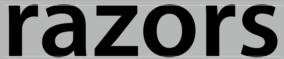
The latter is particularly and important concept when working with letterforms like lowercase ‘r’ that have no counters per se. How well you handle the counters when you set type determines how well words hang together—in other words, how easily the viewer can read what’s been set.

|
| Fig. 1.1.3.2 Unique characteristics of letterforms |
One of the most rewarding way to understand the form and counter of a letter is to examine them in close detail. The examinations also provide a good feel for how the balance between form and counter is achieved and a palpable sense of letterform’s unique characteristics. It also gives you a glimpse into the process of letter-making.
Its worth noting here that the sense of the ‘S’ holds at each stage of enlargement, while the ‘g’ tends to loose its identity, as individual elements are examined without the context of the entire letterform.
4. Contrast

|
| Fig. 1.1.4.1 Basic principles of Graphic Design |
The basic principles of Graphic Design apply directly to typography. The following are some examples of contrast—the most powerful dynamic in design—as applied to type, based on a format devised by Rudi Ruegg. The simple contrasts produces numerous variations: small + organic / large + machined; small + dark / large light …
Week 8 - Typo 6 Screen & Print
0. Introduction
|
| Fig. 1.2.0.1 Typography on prints |

|
| Fig. 1.2.0.1 Typography in screens |
In the past, typography exists only on paper or any other printed materials. Nowadays, typography exists in various forms, not only on paper but also on a multitude of screens such as operating system, system fonts, the device and screen itself, the viewport, etc.
1. Print Type vs Screen Type
i. Type for Print

|
| Fig. 1.2.1.1 Example print type (novel) |

|
| Fig. 1.2.1.2 Example print type (magazine) |
Primarily, type was designed with the intention of reading from print long before we read from screens. A designer’s job is to ensure that the text is smooth, flowing, and pleasant to read.
Good typefaces for print - Caslon, Garamond, Baskerville are the most common typefaces used for print. This is due to their elegant and intellectual characteristics and high readability when set at small font sizes. In addition, they are versatile, easy-to-digest classic typefaces, which holds neutrality and versatility that makes typesetting a breeze.
ii. Type for Screen
Typefaces intended for web use are optimized and often modified to enhance readability and performance onscreen in a variety of digital environments. This can include a taller x-height (or reduced ascenders and descenders), wider letterforms, more open counters, heavier thin strokes and serifs, reduced stroke contrast, as well as modified curves and angles for some designs.
Besides, another important adjustment – especially for typefaces intended for smaller sizes – is more open spacing. All of these factors basically serve to improve the overall readability in non-print mediums, which can include the web, e-books, e-readers, and mobile devices.
iii. Hyperactive Link/ hyperlink
Hyperlink: a word, phrase, or image that you can click on to jump to a new document or a new section within the same document.
Hyperlinks are found in nearly all webpages, allowing users to click their way from a page to another. Text hyperlinks are normally blue and underlined by default. When you move the cursor over a hyperlink, whether it is text or an image, the arrow should change to a small hand pointing at the link.
iv. Font Size for screen
16-pixel text on a screen is about the same size as printed text; this is being accounted for reading distance. Because we read books pretty close , often only a few inches away , they are typically set at about 10 points. If you were to read them at arm’s length, you’d want at least 12 points, which is about identical as 16 pixels on most screens.
v. System Fonts for Screen / Web Safe Fonts
Each device comes with its own pre-installed font type, which is based largely on its operating system. The problem is that each differs a little bit.
For example, Windows-based devices might use a specific type family; whereas, MacOS-based devices pull from another; Google’s own Android-based devices uses their own as well, and so on.
Let’s say a typographer picked some obscure, paid font family for this site’s design. If the viewer doesn't have the same font already installed, and it’s not pulling from a web-friendly source, the font the viewer sees would default to some basic variation. To the viewer, it would just look simply ugly due to the inconsistency.
‘Web safe’ fonts, however, appear across all operating systems. They are a collection of fonts that overlaps from Windows to MacOS to Android devices. Some examples of these 'web safe' fonts are Open Sans, Lato, Arial, Helvetica, Times New Roman, Times, Courier New, Courier, Verdana, Georgia, Palatino, Garamond.
vi. Font Size for screen

|
| Fig. 1.2.1.3 Screen vs Print font sizes |
vii. Pixel Differential Between Devices

|
| Table 1 Comparison of different displays |

|
| Fig. 1.2.1.4 Smart phone vs Smart watch screen size |
Even within a single device class there are a lot of variations. The displays in PCs, tablets, phones and TVs are not only different sizes, but the text you see on-screen differs in proportion too, because they have different sized pixels. 100 pixels on a laptop is very different from 100 pixels on a big 60″ HDTV.
2. Static vs Motion
i. Static typography

|
| Fig. 1.2.2.1 Static typography |

|
| Fig. 1.2.2.1 Billboard |
Static typography has minimal characteristics in expressing words. Traditional characteristics such as bold and italic offer only a fraction of the expressive potential of dynamic properties.
Examples of static typography can range from billboards to posters, magazines to fliers, etc. each with a different purpose. Whether they are informational, promotional, formal or aspirational pieces of designs, the level of impression and impact they leave on the viewer is closely knitted to their emotional connection with the viewer.
i. Motion typography
According to Woolman and Bellantoni (1999), temporal media offer typographers opportunities to “dramatize” type, for letterforms to become “fluid” and “kinetic”. Film title credits present typographic information over time, often bringing it to life through animation. Motion graphics, particularly the brand identities of film and television production companies, increasingly contain animated type.
Type is often used in music videos and advertisements as overlays, often set in motion following the rhythm of a soundtrack. On-screen typography has developed to become expressive, helping to establish the tone of associated content or express a set of brand values. In title sequences, typography must prepare the audience for the film by evoking a certain mood.
INSTRUCTIONS
MIB:
Task 2 - Typographic Exploration & Communication (Text Formatting and Expression)
1. Week 6 - Sketches and title design

|
| Fig. 2.1.1 Initial rough sketch, Week 6 (07/05/2022) |
I started off by sketching out the ideas I have in mind using a drawing pad in Photoshop. At this stage, I couldn't really think of good ideas, so I decided to move on to the next step, and see if any better ideas would pop in my mind.

|
| Fig. 2.1.2 Title typeface choices, Week 6 (07/05/2022) |
I plan to use some sort of san serif typeface for my body text, and decided to use serif typefaces for the title to show good contrast. So, I listed out three serif typefaces that I like from the 10 typefaces provided, and ultimately decided on Bodoni.

|
| Fig. 2.1.3 Title idea 1, Week 6 (07/05/2022) |

|
| Fig. 2.1.4 Title idea 2, Week 6 (07/05/2022) |

|
| Fig. 2.1.5 (Chosen) Title idea 3, Week 6 (07/05/2022) |
As I was digitizing Fig. 2.1.4 Title idea 2, I asked myself out of a sudden: "What if I make the words somehow connected to each other to emphasize the word FOLLOW?" So, I came up with the chosen design as seen in Fig. 2.1.5, which works out in my opinion.
2. Week 7 - Text formatting in Indesign

|
| Fig. 2.2.1 All text, Week 7 (09/05/2022) |

|
| Fig. 2.2.2 Place title in the page, Week 7 (09/05/2022) |

|
| Fig. 2.2.3 A different typeface for the first line of a paragraph, Week 7 (09/05/2022) |

|
| Fig. 2.2.4 Initial arrangements of paragraphs, Week 7 (09/05/2022) |
I started putting in paragraphs of text into the page and look for the best composition possible.

|
| Fig. 2.2.5 Number of characters in one line, Week 7 (09/05/2022) |
At this stage, the font size of body text is 8.5pt (characters per line appx. 60); as for the italic serif text, its font size is 9pt to match the letter height of the body text.

|
| Fig. 2.2.6 Changed second page arrangement, Week 7 (09/05/2022) |
Now, my first pre-composition is done and I proceed to creating more layouts to I have a wide selection to choose from.

|
| Fig. 2.2.7 Pre-composition 1, Week 7 (09/05/2022) |

|
| Fig. 2.2.8 Pre-composition 2, Week 7 (09/05/2022) |

|
| Fig. 2.2.9 Pre-composition 3, Week 7 (09/05/2022) |
These are the three pre-compositions that I've come up with. I ensured all the letterspacing, leading, paragraph spacing and cross alignment are achieved. (but still missed an orphan in the first paragraph of the third pre-composition...*facepalm*)
3. Post-feedback changes
Pre-composition 1: Before vs after

|
| Fig. 2.3.1 Pre-comp 1 - before amendments, Week 7 (11/05/2022) |

|
| Fig. 2.3.2 Pre-comp 1 - after amendments, Week 7 (11/05/2022) |
Here, I increase the space between the work CODE and the first paragraph slightly to match the paragraph spacing of the body text. I also removed the orphan at the third to last paragraph. In addition, I narrowed down the margins to 10mm so everything could fit in better.
Pre-composition 3: Before vs after

|
| Fig. 2.3.3 Pre-comp 3 - before amendments, Week 7 (11/05/2022) |

|
| Fig. 2.3.4 Pre-comp 3 - after amendments, Week 7 (11/05/2022) |
I changed the paragraph width of the top paragraph in the second page to match the widths of the others, as different paragraph widths are generally not advisable to use in information of the same hierarchy/importance.
Title changes: Before vs after

|
| Fig. 2.3.5 Title - before amendments, Week 7 (11/05/2022) |

|
| Fig. 2.3.5 Title - after amendments, Week 7 (11/05/2022) |
|
|
After hearing comments about my title design from Mr Vinod, I agree with
him that although the idea is clear, it looks more on the simplistic side.
So, I decided to change the typeface of the word CODE. I also used
lowercase letters for it and added a full stop at the end. This is because
these two elements resembles coding itself. This way, the title looks less
simplistic but is still able to maintain the original idea.
Final Changes

|
| Fig. 2.3.6 Final composition 1, Week 7 (11/05/2022) |

|
| Fig. 2.3.6 Final composition 2, Week 7 (11/05/2022) |
For the final amendments, I inserted the new title into the page. For the first composition, I moved the first paragraph towards the left to achieve visual balance. As for the third composition, I adjusted the text size so that the number of characters is around 35. It was slightly too small and the number of characters was around 37 - 41, which was not ideal.
Final Outcome - Typographic Exploration & Communication (Text Formatting and Expression)

|
| Fig. 2.3.7 Final outcome, Week 7 (11/05/2022) |
Ultimately, I chose pre-composition 3 as my final design over pre-composition 1 due to various reasons. One of the main reasons is that this composition has clear movement across the two pages to guide the reader's eye. In my opinion, this composition looks more visually appealing compared to he other one, while maintaining readability and functionality.
Details
Font: Bodoni Std, Serifa Std, ITC Garamond, Univers LT Std
Typeface:
Bodoni Std Poster & Bold, Serifa Std 55 Roman; Body - ITC Garamond
Bold Italic, Univers LT Std 55 Roman
Font size: 9.5pt, 10pt
Leading:
11.5pt
Paragraph Spacing: 11.5pt
Average characters per line:
34-38
Alignment: Left justified
Margins: top 12.7mm / left
12.7mm / right 12.7mm / bottom 12.7mm
Columns: 3
Gutter
(for columns): 4.233mm
PDF Files
3. Post-submission changes
Mr Vinod's comment: "The last two columns of the body text might be better if it was aligned?"

PDF Files
FEEDBACK
Week 7 - Typographic Exploration & Communication (Text Formatting and Expression)
General Feedback: The title is well designed that makes it memorable to the eye, but quite simplistic. The use of a different typeface to indicate hierarchy in the body text is good. However, paragraphs of the body text of the same importance/hierarchy MUST be the same size (in terms of line length and paragraph width). Short paragraph widths is allowed at around 35 characters per line.
Specific Feedback: Beware of orphans. Do remember the tinu details, such as cross alignment with the title; space between title and body text can be more visually appealing if it is the same as the paragraph spacing.
REFLECTION
Experience
Overall, this project was challenging as expected, from idea development to digitization to the final stages of the project. It is a combination of the previous exercises that challenges our understanding of them.
Throughout the project, I kept a phrase in mind: 'Function over form'. As someone who does a lot of drawing, I could easily overlook readability for aesthetics. However, with my understanding of Typography from previous lectures, I try to design something simple, while maintaining some levels of complexity.
During the digitization, I was also struggling to come up with a visually appealing and clear composition. I took some some and tried many arrangements until I am satisfied with one.
Observation
Throughout this project, I observed that the tiny details could make a huge difference in how the overall composition will turn out. For example, alignments. In order to be a good typographer, one does not only have to think about the choices of typefaces and font sizes, but text alignment and visual balance can make a significant difference too.
I have also observed that I am more familiar with the software now, especially InDesign.
Findings
One of the most important discovery I realized in this project was making difficult decisions. I was deciding whether I should have short paragraph widths in my design that however, contradicts what I was thought in class - line length should generally be 55-65 characters. I ultimately decided to take the risk and go ahead with my idea. From this, I learnt that making designs require taking risks at times, and who knows? The design just might work after taking a risky decision.
FURTHER READING
Article 1: Typography 101: Everything you need to know about fonts!
Link: https://fabrikbrands.com/typography-everything-you-need-to-know-about-fonts/
Under the section of 'Fonts and moods!', the author explains about how fonts express different moods similarly to human beings. As human beings, we often experience mood swings. When we experience a specific emotion, we would express it using actions, words, or even virtual emojis.
Interestingly, typefaces plays an important role in expressing the right mood at the right time. Different typefaces brings a different mood or emotion to the human eye.
According to Microsoft researchers Kevin Larson and Rosalind Picard, “high-quality typography appears to induce a positive mood”.
The Software Usability Research Lab of Wichita State University also conducted a survey to find out whether different fonts can induce certain emotions. The researchers asked the participants to associate every font with a certain emotion or feeling. As for the result, it turned out pretty interesting, as majority of people agreed that San Serif typefaces represent an all-purpose personality. The Serif typeface; however, represents a more traditional personality.
In addition, Times New Roman turned out to be more attractive than Courier, according to the research. Personally, I disagree with this as I find Courier more attractive. I think it gives out a stronger sense of uniformity compared to Times, but that might be just me.

|
| Fig. i Association of fonts with moods |
In Fig. i, we can see the top three fonts associated with each mood or feeling considered in the survey.
Article 2: How typography impacts your mood
Link: https://shyndman.medium.com/how-typography-impacts-your-mood-5bbc3386de03
Physically, we convey a wide range of emotional cues from the subtle to the dramatic with the use of our voice, facial expressions. actions, etc. In typography, the sue of typefaces provide a similarly extensive emotional range.
In 1933, Poffenberger and Barrows studied the communication of emotions and moods using shapes and simple lines. Their theory was that when we look at a line our eyes move along the shape. They asked participants to associate emotions form a line to each of the 18 curved and jagged lines sloping in different directions. A line going downwards was shown to express “dolefulness”, while an upward line expresses “joy”.
There is a correlation between what we experience in the physical world and how we interpret typeface shapes. Type can be seen as mirroring the emotions we display in the real world through our facial expressions and gestures. For instance, our faces become round with a wide smile and our body language is open when we are happy. On the flip side, an angry frown expression is pinched and angled, just like an attacking animal with jagged teeth and claws.
Our emotions or mood can be reflected in our handwriting. When writing quickly, one's mood is italicized and when angry it becomes bold and deliberate.

|
| Fig. ii Type and emotions survey |

|
| Fig. iii Type and emotions survey results |
Fig. ii shows an online survey on the direction of text matches the meaning of a word best. Fig. iii are the results.


Comments
Post a Comment