Advanced Typography Task 1 - Exercises: Typographic Systems & Type & Play
29/08/2022 - 05/10/2022 (Week 1 - Week 5)
WONG JUN ZHE / 0353613
Advanced Typography / B' Creative Media / Taylor's University
Task 1 / Exercises

LECTURES
Week 1 - AdTypo 1: Typographic Systems
1. Typographic Systems
Typographical organization is complex because the elements are
dependent on communication in order to function + other criteria such
as hierarchy, order of reading, legibility, and contrast.
The typographic systems are related to what architects term
shape grammars. The typographic systems are similar that the
systems has a set of rules that is unique and
provides a sense of purpose that focuses and directs the decision
making.
Shape grammar - a
set of shape rules that apply in a step-by-step way to generate a set,
or language, of designs
Eight major variations with an infinite number of permutations:

|
| Fig. 1.1.1.1 Axial System, Week 1 (31/08/2022) |
Axial System: All elements are organised to the left or right
of a single axis.

|
| Fig. 1.1.1.2 Radial System, Week 1 (31/08/2022) |
Radial System: All elements are extended from a point of
focus.

|
| Fig. 1.1.1.3 Dilatational System, Week 1 (31/08/2022) |
Dilatational System: All elements expand from a central
point in a circular fashion.

|
| Fig. 1.1.1.4 Random System, Week 1 (31/08/2022) |
Random System: Elements appear to have no specific pattern
or relationship.

|
| Fig. 1.1.1.5 Grid System, Week 1 (31/08/2022) |
Grid System: A system of vertical and horizontal
divisions.

|
| Fig. 1.1.1.6 Transitional System, Week 1 (31/08/2022) |
Transitional System: An informal system of layered banding.

|
| Fig. 1.1.1.7 Modular System, Week 1 (31/08/2022) |
Modular System: A series of non-objective elements that are
constructed in as a standardised units.

|
| Fig. 1.1.1.8 Bilateral System, Week 1 (31/08/2022) |
Bilateral System: All text is arranged symmetrically on a
single axis.
Week 2 - AdTypo 2: Typograhic Composition
1. Principles of Design Composition

|
| Fig. 1.2.1.1 Use of Emphasis in Type |
Dominant principles underpinning design composition: emphasis,
isolation, repetition, symmetry and asymmetry, alignment,
perspective, etc.
Said principles can be ambiguous when it comes to translating it
into typographic layouts or composition.
2. The Rule of Thirds

|
| Fig. 1.2.2.1 Rule of Thirds in Type |
A photographic guide to composition taht suggests the division of a frame (space) into 3 columns and 3 rows.
Intersecting lines are used as guides to place the points of
interest.
However in type, no one would realistically ever use the
rule of thirds when there are better options.
3. Typograpic Systems

|
| Fig. 1.2.3.1 Grid System "How to" |
Among the 8 systems the most pragmatic and the most used system is
the Grid System.
Although the Grid System may seem to be old or rigid, what
stands out is its versatility and its (to some extent) modular
nature, which allow an infinite number of adaptations.

|
| Fig. 1.2.3.2 Examples of Chaos/Randomness in Typography Compositions |
On the other hand, a group of younger designers began to question and challenge the
'order' element in type. Therefore, post-modernist era in
Typographical systems arose, where chaos, randomness and asymmetry
were explored. Legibility and readability took a step bac,
but the real challenge is to combine both approaches
seamlessly.
4. Other models / Systems
i. Environmental Grid

|
| Fig. 1.2.4.1 Examples of Environmental Grid |
Based on the exploration of an existing structure or numerous
structures combined.
An extraction is first being carried out. Then, the designer organizes the collected information around this
super-structure, which includes non-objective elements to create a
unique and exciting mixture of texture and visual stimuli.
It provides
context to the forms developed in the designs—context why?
That's because the system/structures were developed around key
features of an environment associated to the communicators of the
message.
ii. Form and Movement

|
| Fig. 1.2.4.2 Form and Movement |
Based on the exploration of an existing Grid
System.
This system is developed to explore; the multitude of options the grid offer; to dispel
the seriousness surrounding the application of the grid system;
and to see the turning of pages in a book as a slowed-down
animation in the form that constitutes the placement of image,
text and color.
The placement of a form (irrespective of what it is) on a page,
over many pages creates movement.
"There is a fine line between genius and insanity, just as
there is a fine line between legibility-readability &
memorability."
— 1st point came Oscar from Levant, second from Mr Vinod.
Week 3 - AdTypo 3: Context & Creativity
1. Handwritting (Latin Alphabet)
Handwriting is the basis or standard for form, spacing and
conventions mechanical type would try and mimic.
The shape and line of hand drawn letterforms are influenced by
the tools and materials used to make them, such as sharpened
bones, charcoal sticks, brushes, etc; as well as the material
upon the forms are written, such as paper, clay, animal skin,
etc.

|
| Fig. 1.3.1.1 Evolution of the Latin Alphabet |
i. Cuneiform // c. 3000 B.C.E.

|
| Fig. 1.3.1.1 Cuneiform |
Cuneiform is known as the earliest system of actual writing. It
was used in a number of languages between the 34C. B.C.E.
through the 1st century C.E
ii. Hieroglyphics // 2613–2160 B.C.E.
The Egyptian writing system is fused with the art of relief
carving. The Egyptian writing system is fused with the art
of relief carving.
Hieroglyphic images have the potential to be used in three
different ways:
- As ideograms, to represent the things they actually depict.
- As determinatives to show that the signs preceding are meant as phonograms and to indicate the general idea of the word.
- As phonograms to represent sounds that "spell out" individual words.
iii. Early Greek // 5th C. B.C.E.
The Phoenicians developed a phonetic alphabet consisting of 22
letters. The Greeks adopted the Phoenicians system and added the
necessary vowels.
iv. Roman Uncials
By the 4th century Roman letters were becoming more rounded,
the curved form allowed for less strokes and could be written
faster.
v. English Half Uncials // 8th C.
The uncial evolved into a more slanted and condensed form in
England.
vi. Carolingian Minuscule
The Carolingian minuscule was used for all legal and literary
works to unify communication between the various regions of
the expanding European empire.
It was as important a development as the standard Roman
capital—for it was this style that became the pattern for the
Humanistic writing of the fifteenth century; this latter, in
turn was the basis of our lower-case roman type.
vii. Black Letter // 12-15 C. CE
Gothic was the culminating artistic expression of the middle
ages, occurring roughly from 1200—1500.
The term Gothic originated with the Italians who used it to
refer to rude or barbaric cultures north of the Italian
Alps.
viii. Movable Type 11 C.—14 C.
The introduction of moveable type was introduced in the
1000-1100 CE. This innovation was pioneered in China but
achieved in Korea (Diamond Sutra).
In the late 1300-1399 CE, several decades before the earliest
printing in Europe (Guttenberg’s bible 1439), the Koreans
establish a foundry to cast movable type in bronze.
2. Eastern Developments in Handwriting
With the digital revolution, the west would begin to digitize
many of its historical creations and type foundries would
create, market and sell or license them. The recognition of
the importance of these historical letterforms is
something to be admired and learned from.

|
| Fig. 1.3.2.1 Evolution of Middle Eastern Alphabets |
It is also important to note that while the Phoenician letter marks a turning point in written language—use of sound represented in letters—the script itself has been possibly influenced by the Egyptian Hieroglyphics and Hieratic Scripts.
|
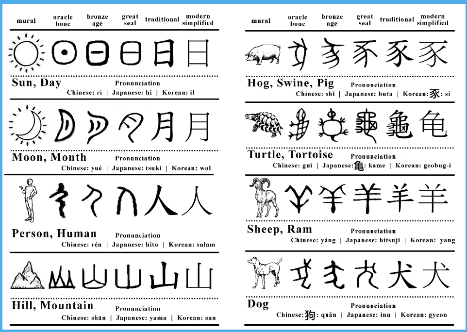
| Fig. 1.3.2.2 Evolution of the Chinese Script |
From the Oracle bone to Seal Script to Clerical Script,
Traditional and Simplified scripts.

|
| Fig. 1.3.2.3 ‘Indian’ subcontinent the Indus Valley Civilization (IVC) script (3500-2000 BCE) |
The oldest writing found in the
‘Indian’ subcontinent the Indus Valley Civilization (IVC)
script
(3500-2000 BCE), is as yet undeciphered and seems to have been
somewhat logo-syllabic in nature.

|
| Fig. 1.3.2.4 Brahmi script (450–350 BCE) |
The Brahmi script (450–350 BCE) is the earliest writing
system developed in India after the Indus script. It is one of
the most influential writing systems; all modern Indian
scripts and several hundred scripts found in Southeast and
East Asia are derived from Brahmi.
*Refer to lecture slides for SEA handwrittings.*
So, why is handwriting important in the study of
type/typography?
Basically, it is because the first mechanically produced
letterforms were designed to directly imitate handwriting.
Handwriting would become the basis or standard that for form,
spacing and conventions mechanical type would try and mimic.
2. Programmers and Type Design
More vernacular scripts are being produced by software giants
(Google): in their employment a great many Asian programmers
and designers.
More and more
vernacular and “multi-script” typefaces —a term coined
by Muthu Nedumaran—are being produced to cater to situations
where the written matter is communicated in the vernacular
script or vernacular and Latin scripts.
3. Local Movements and Individuals
In Malaysia, murasu.com spear-headed by programmer and
typographer Muthu Nedumaran, the man who cracked the programming
language needed to encode the different types of vernacular
writing systems. The system is now used in mobile phones
and desktops.
Huruf, a local group of graphic designers interested in the
localized lettering of latin and vernacular letters painted or
inscribed on walls and signages are amongst the more prominent
organizations digitizing and revitalizing typefaces in
Malaysia.
Ek Type and Indian Type Foundry (India).
Creativity and originality are properties that are most
often intertwined. It is important for young designers to look
inward and examine their
histories, civilization, culture and communities to
bring these past developments into the future and develop on
them instead of blindly appropriating cultures and
developments that have no context, relatability or relevance.
Creativity and inspiration should begin by
observing our surroundings and exploration of our
collective histories.
Week 4 - AdTypo 4
Xavier Dupre (2007): type design carries a social responsibility so one must
continue to improve its legibility; type design is a form
of artistic expression.
1. Adrian Frutiger
Adrian Frutiger is a renowned twentieth century Swiss
graphic designer. His valued contribution to typography
includes the typefaces Univers and
Frutiger.
The goal of this new typeface (Frutiger) was create a clean,
distinctive and legible typeface that is easy to see from
both close up and far away. Extremely functional.
Considerations/Limitations: letterforms needed to be
recognized even in poor light conditions or when the reader
was moving quickly past the sign.
2. Matthew Carter
 |
| Fig. 1.4.2.1 Georgia and Verdana |
Many of Carter's fonts were created to address specific
technical challenges, for example those posed by early
computers. A good example is his creation of Verdana
(1996) for Microsoft.
 |
| Fig. 1.4.2.2 Bell Centennial |
In 1976, AT&T commissioned the design of a new typeface
whose sole purpose would be for use in their telephone
directories. The design had to solve multiple technical and
visual problems related with the existing phonebook
typeface, Bell Gothic. The solution, named in honour of the
company's 100th anniversary, was Bell Centennial.
3. Edward Johnston
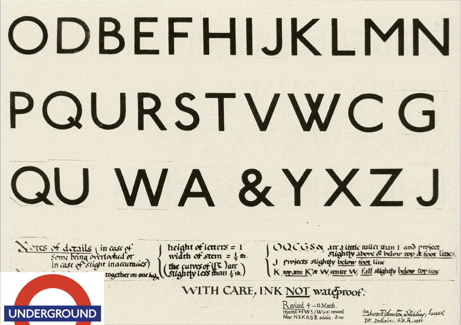 |
| Fig. 1.4.3.1 “Underground” typeface |
Edward Johnston is the creator of the hugely influential
London “Underground” typeface, which would later come to
be knows as “Johnston Sans” (1916).
Purpose: London's Underground railway ordered a new
typeface for its posters and signage from the calligrapher
Edward Johnston. He handed over details and examples of
letter shapes that would set the tone for printed text
until the present day.
4. General Process of Type Design:
i. Research
When creating type, we should understand
type history, type anatomy and type conventions. It
is then important to determine the type’s purpose or what it
would be used for, and what different applications it will
be used in. We should also examine existing fonts that are
presently being used for
inspiration / ideas / reference / context / usage pattern
/ etc.
2. Sketching
Some designers sketch their typeface using the traditional
tool set (brushes/ pens, ink and paper), and some prefer to
sketch digitally.
Both methods have their positives and negatives.
3. Digitization
The two leading softwares for font digitization are FontLab
and Glyphs App. There are designers that also use Adobe
Illustrator to design or craft the letterforms and then
introduce it into the specialized font apps.
4. Testing
The results of the testing is part of the process of
refining and correcting aspects of the
typeface. Depending on the typeface category (display
type/text typ) the readability and legibility of the the
typeface becomes an important consideration.
5. Deploy
Even after deploying a completed typeface there are always
teething problems that did not come to the fore during the
prototyping and testing phases. Thus, the task of revision
doesn’t end upon deployment.
The rigour of the testing is important in so that the
teething issue remain minor.
5. Typeface Construction
 |
| Fig. 1.4.5.1 Roman Capital Grids |
Roman Capital: The grid consists of a square, and inside it
a circle that just touches the lines of the square in four
places. Within the square, there is also a rectangle. This
rectangle is three quarters the size of the square and is
positioned in the centre of the square.
Thus, using grids (with circular forms) can facilitate the
construction of a letterforms and is a possible method to
build/create/design your letterform.
6. Construction and considerations:
An important visual correction is the extrusion of curved
(and protruding) forms past the baseline and cap line.
This also applies to vertical alignment between curved and
straight forms.
The letters must be altered to a uniform ‘visual’ white
space. This means that the white space between the letters
should appear the same. This is called
‘fitting’ the type.
The consideration when creating a typeface cannot be covered
in its entirety in a single lecture or in a couple of
slides.
Most typefaces come about due to a need or demand. The
need/motivation can be intrinsic and extrinsic:
Intrinsic basically means that the designer has an
inexplicable need driven by interest to design a typeface,
and seeks out a form that comes close to fulfilling a
desire.
Extrinsic can be summed up in this way the designer has
been commissioned or the student-designer has a task to
complete that involves designing a typeface.
Designing a typeface is a labour of love. Only the
brave and foolish walk this path for the reward pale in
comparison to the work.
Week 5 - AdTypo 5
Perception - the way in which something is regarded,
understood, or interpreted.
Perception in typography deals with the visual
navigation and interpretation of the reader via
contrast, form and organisation of the content.
(Content can be textual, visual, graphical or in the
form of colour.)
1. Contrast
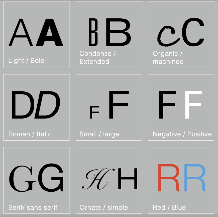
|
| Fig. 1.5.1.1 Contrast in Typography |

|
| Fig. 1.5.1.2 Contrast / Size |
A contrast of size provides a point to which the
reader’s attention is drawn. The most common use of size is in making a title or
heading noticeably bigger than the body text.
ii. Weight

|
| Fig. 1.5.1.3 Contrast / Weight |
Weight describes how bold type can stand out in the middle of lighter type of the same style. Other than then using bold, using rules, spot, squares is also provide a “heavy area” for a powerful point of visual attraction or emphasis, therefore not only types of varying weight.
iii. Form

|
| Fig. 1.5.1.4Contrast / Form |
iv. Structure

|
| Fig. 1.5.1.5 Contrast / Structure |
Structure means the different letterforms of
different kinds of typefaces.
v. Texture

|
| Fig. 1.5.1.6 Contrast / Texture |
By putting together the contrasts of size, weight,
form, and structure, and applying them to a block of
text on a page, you come to the contrast of
texture.
Texture refers to the way the lines of type look as a
whole up close and from a distance.
vi. Direction

|
| Fig. 1.5.1.7 Contrast / Direction |
Contrast of direction is the opposition between vertical and horizontal, and the angles in between. Turning one word on its side can have a dramatic effect on a layout. Mixing wide blocks of long lines with tall columns of short line can also create a contrast.
vii. Colour
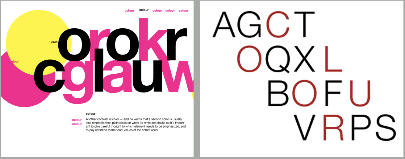 |
| Fig. 1.5.1.8 Contrast / Colour |
The use of color is suggested that a second color is
often less emphatic in values than plain black on
white.
2. Form
Form refers to the overall look and feel of the
elements that make up the typographic composition.
It is the part that plays a role in visual impact
and first impressions.
A good form in typography tends to be visually
intriguing to the eye; it leads the eye from point
to point, it entertains the mind and is most often
memorable.
|
| Fig. 1.5.2.1 Form |
Typography can be seen as having two functions: First, to represent a concept; second, to do so in a visual form. Displaying type as a form provides a sense of letterforms’ unique characteristics and abstract presentation.
|
| Fig. 1.5.2.2 Example of Form in Posters |
When a typeface is perceived as a form, it no longer
reads as a letter because it has been manipulated by
distortion, texture, enlargement, and has been
extruded into a space.
3. Organisation / Gestalt
Gestalt is a german word meaning the way a thing has
been “placed” or “put together”. Gestalt Psychology
is an attempt to understand the laws behind the
ability to acquire and maintain meaningful
perceptions.
*A designer should understand visual perception.
This would apply to every aspect of design,
including typography.
Perceptual Organisation / Groupings:
1. Law of Similarity - elements that are
similar to each other tend to be perceived as a
unified group.
2. Law of Proximity - elements that are close
together tend to be perceived as a unified
group.
3. Law of Closure - the mind’s tendency to see
complete figures or forms even if a picture is
incomplete, partially hidden by other objects, or if
part of the information needed to make a complete
picture in our minds is missing.
4. Law of Continuation - humans tend to
perceive each of two or more objects as different,
singular, and uninterrupted object even when they
intersect.
5. Law of Symmetry -
6. Law of Simplicity (Praganz)
7. ...
INSTRUCTIONS
MIB:
Task 1 - Exercises: Typographic Systems
0. Introduction
In this task, we are assigned to produce designs according to the 8
typographical systems. I wanted to create visually appealing designs.
Requirements:
- Size 200 x 200 mm
- Colours: Black and additional colour
- Minor graphical elements
All body texts are 9 pt to 12 pt, with a 14 pt leading.
1. Axial system
The information are arranged in a way that is left-side heavy. However,
it is well balanced out using graphical elements at the right
side.
Fonts used:
Univers LT Std 75 Black
ITC New Baskerville Std Roman, Bold
Initial Design

|
| Fig. 2.1.1.1 Axial system, Initial design, Week 1 (31/08/2022) |
Post-Feedback Design

|
|
|
2. Radial system
For this system, I want to crate a system with a degree of 'tidiness'
but not too tidy. When a design becomes too balanced/tidy, it will
look boring and not as artistic.
Fonts used:
Adobe Caslon Pro Bold // Futura Std Bold, Medium, Light,
Light Oblique.
Final Design

|
| Fig. 2.1.2.1 Radial system, Final design, Week 1 (31/08/2022) |
3. Dilatational system
For the dilatational system, I tried to come up with.a
unique shape. The design I settled for last kind of looks like a
raindrop, which is quite interesting. However, the bottom looks
slightly too heavy.
Fonts used:
Univers LT Std 67 Bold Condensed, 57 Condensed // Futura Std
Heavy, Medium // Bembo Std Regular
Initial Design

|
| Fig. 2.1.3.1 Dilatational system, Initial design, Week 1 (31/08/2022) |
Post-Feedback Design

|
|
|
4. Random system
At first, I was having struggling to create a messy and random
composition. In addition, I did a mistake of using outlines for
texts of smaller sizes. After making some changes, I think the
final design looks pretty decent, as it is random, but still maintain
some amount of readability.
Fonts used:
Futura Std Extra Bold Oblique, Light Oblique, Light Condensed, Book //
Janson Text LT Std 75 Bold // Gill Sans Semi Bold // Univers LT
Std 93 Extra Black Extended, 75 Black, 55 Roman // Adobe
Caslon Pro Regular // Bembo Std Regular // ITC New Baskerville
Std Italic, Bold // Bodoni 72 Book Italic
Initial Design

|
|
|
Post-Feedback Design

|
|
|
5. Grids system
This system requires us to arrange information in vertical and
horizontal grids. The first attempt looks too unbalanced and
looked unappealing overall. I fixed the proportions and weight of
the left and right side of the page and it looks alright
now.
Fonts used:
Serifa Std 55 Roman // ITC New Baskerville Std Bold Italic,
Bold, Roman
Initial Design

|
|
|
Post-Feedback Design

|
|
|
6. Transitional system
I emphasised on the title by using a bold font. The other
information are arranged according to their importance.
Fonts used:
Futura Std Extra Bold Condenses, Bold Condensed, Medium Condensed,
Light Condensed
Initial Design

|
|
|
Post-Feedback Design

|
|
|
7. Modular system
Number of columns: 4
Number of rows: 7
Fonts used:
Adobe Caslon Pro Bold Italic // ITC New Baskerville Std Bold // Futura
Std Medium Condensed, Book
Initial Design

|
|
|
Post-Feedback Design

|
|
|
8. Bilateral system
The two boxes at the two corners are to balance out the page. I
also made sure all the information are aligned to the baseline
grids.
Fonts used:
Serifa Std 65 Bold // ITC New Baskerville Std Bold // Gill Sans Light,
Regular
Initial Design

|
|
|
Post-Feedback Design

|
|
|
Final Outcome

|
|
|

|
| Fig. 2.1.9.2 Final radial system design, Week 2 (07/08/2022) |

|
| Fig. 2.1.9.3 Final dilatational system design, Week 2 (07/08/2022) |

|
| Fig. 2.1.9.4 Final Random system design, Week 2 (07/08/2022) |

|
| Fig. 2.1.9.5 Final Grids system design, Week 2 (07/08/2022) |

|
| Fig. 2.1.9.6 Final transitional system design, Week 2 (07/08/2022) |

|
| Fig. 2.1.9.7 Final modular system design, Week 2 (07/08/2022) |

|
| Fig. 2.1.9.8 Final bilateral system design, Week 2 (07/08/2022) |
PDF Files
Task 1 - Exercises: Type & Play (Part 1)
0. Introduction
In this exercise, We are tasked to design five letters that are
inspired from an image. The final design must reflect on the image's
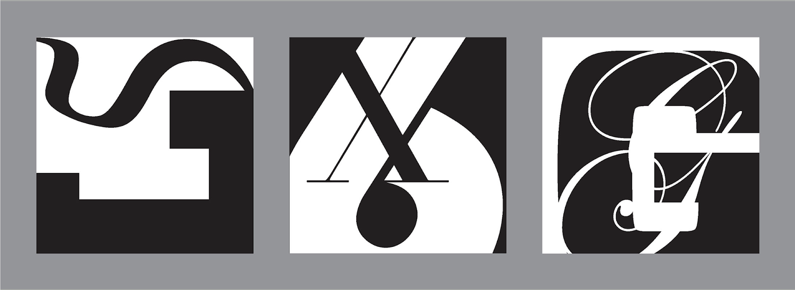
identity. The first step is to extract the letters from the image itself
with precision. Then, continuous refinement is neccesary to produce
consistent and visually appealing designs.
0. Extraction

|
| Fig. 2.2.0.1 Original reference image, Week 3 (14/09/2022) |

|
| Fig. 2.2.0.2 Extraction / Trace, Week 3 (14/09/2022) |
I thought about what kinds of pictures I can find letterforms in. It
does not have to be exact leers, just letter look-alike.
Ideas I have thought about are:
- Spider web
- Pipes
- Butterfly wing patterns
Ultimately, I decided to go for the chrome, bronze pipes. I traced the
letter-like shapes out using the pen tool according to my
observation.
1. Refinement

|
| Fig. 2.2.1.1 Reference font, Week 3 (14/09/2022) |
I chose Gill Sans Std Bold Condensed as my reference font as it resembles
the look that I am going for.

|
| Fig. 2.2.1.2 Extracted shapes, Week 3 (14/09/2022) |
Step 1: Resized extracted shapes into a more consistent
size.

|
| Fig. 2.2.1.3 Refinement 1, Week 3 (14/09/2022) |
Step 2: Filled in colour. (Tools used: pen tool, pathfinder)

|
| Fig. 2.2.1.4 Refinement 2, Week 3 (14/09/2022) |
Step 3: Simplified shapes and removed the 'tail' on letter
'E'.

|
| Fig. 2.2.1.5 Refinement 3, Week 3 (14/09/2022) |
Step 4: Cut out red areas using pathfinder to create a highlight
effect.

|
| Fig. 2.2.1.6 Refinement 4, Week 3 (14/09/2022) |
Step 5: Changed the shapes of letters 'E' and 'T'.

|
| Fig. 2.2.1.7 Refinement + Reconstruction, Week 4 (21/09/2022) |
Step 6: Redesigned letters 'S' and 'E' to fit the style of the other
letters. This promotes consistency.

|
| Fig. 2.2.1.8 Final refinement, Week 4 (21/09/2022) |
Step 7: Further simplification and removing unnecessary parts to make it
look consistent as a whole. I left a unique spot in only letter
'L'.
Final Letters and Showcase

|
| Fig. 2.2.2.1 Final letter L, Week 4 (21/09/2022) |

|
| Fig. 2.2.2.2 Final letter J, Week 4 (21/09/2022) |

|
| Fig. 2.2.2.3 Final letter S, Week 4 (21/09/2022) |

|
| Fig. 2.2.2.4 Final letter E, Week 4 (21/09/2022) |

|
| Fig. 2.2.2.5 Final letter T, Week 4 (21/09/2022) |

|
| Fig. 2.2.2.6 All letters, Week 4 (21/09/2022) |

|
| Fig. 2.2.2.7 Type showcase, Week 4 (21/09/2022) |
PDF Files
Task 1 - Exercises: Type & Play (Part 2)
0. Introduction
In this exercise, we are required to create a wallpaper-like design,
either with the theme of 'Cultural Prosperity' or 'Renewal of Life'. The
design has to include both typography and
graphics/photography.
1. Idea Development
Initially, I have 2 ideas, one for 'Cultural Prosperity' and one for
'Renewal of Life'.The first thing that comes to my mind when I hear about 'Cultural
Prosperity' is the Koi fish. On the other hand, as I was looking through
older photos, I found a a photograph of the fiddlehead sprout taken for
a previous project. Ultimately, I chose the first idea.
 |
| Fig. 2.3.1.1 Fiddlehead sprout photograph |
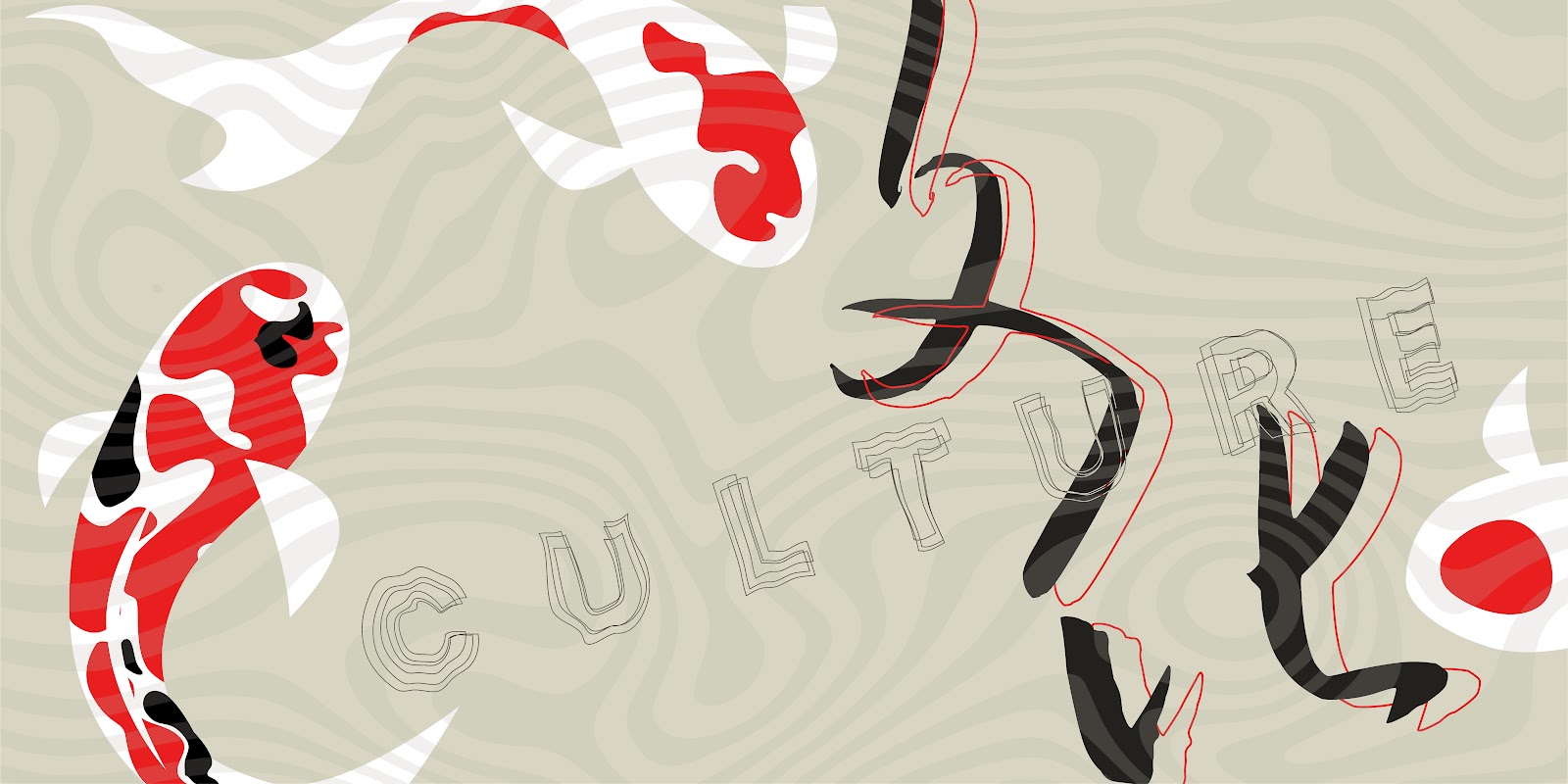
Koi fish has always been a symbol of appreciation to the Asian culture.
Spiritually, the Koi fish symbolises luck, fortune, wealth, family
harmony, and positivity. In Feng Shui, the precence of Koi is the
welcoming of auspicious abundance and prosperity.
Through my artwork, I aim to create a piece that is aestetically
pleasing and meaningful at the same time, with the idea of desktop
wallpaper design in mind. That said, the design must not be too
complicated as functionality should also exist to compliment the
aesthetics.
Thus, the idea is to seamlessly combine two major aspects together:
Graphic and Typography, so that they seem to be united, in a rather
minimalistic style.
2. Sketches

|
| Fig. 2.3.2.1 Sketch 1, Week 4 (22/09/2022) |

|
| Fig. 2.3.2.2 Sketch 2, Week 4 (22/09/2022) |
Before I head right into creating the vector wallpaper, I made rough sketches of how I want it to look like in Photoshop first.
3. Digitization

|
| Fig. 2.3.3.1 Initial Digitization 1, Week 4 (24/09/2022) |

|
| Fig. 2.3.3.2 Initial Digitization 2, Week 4 (24/09/2022) |
|
| Fig. 2.3.3.3 Water-like effect, Week 4 (24/09/2022) |
Firstly, I used the pen tool to draw the Koi fishes, each with a different pattern. I looked up for reference images on the Internet to see the colour and pattern variations of the Koi fish.
Then, I inserted a rectangle as the solid background colour, almost
like a quill grey with a yellow hue. This is inspired by the colour of
the antique papers that are used in Chinese ink painting
(水墨画),
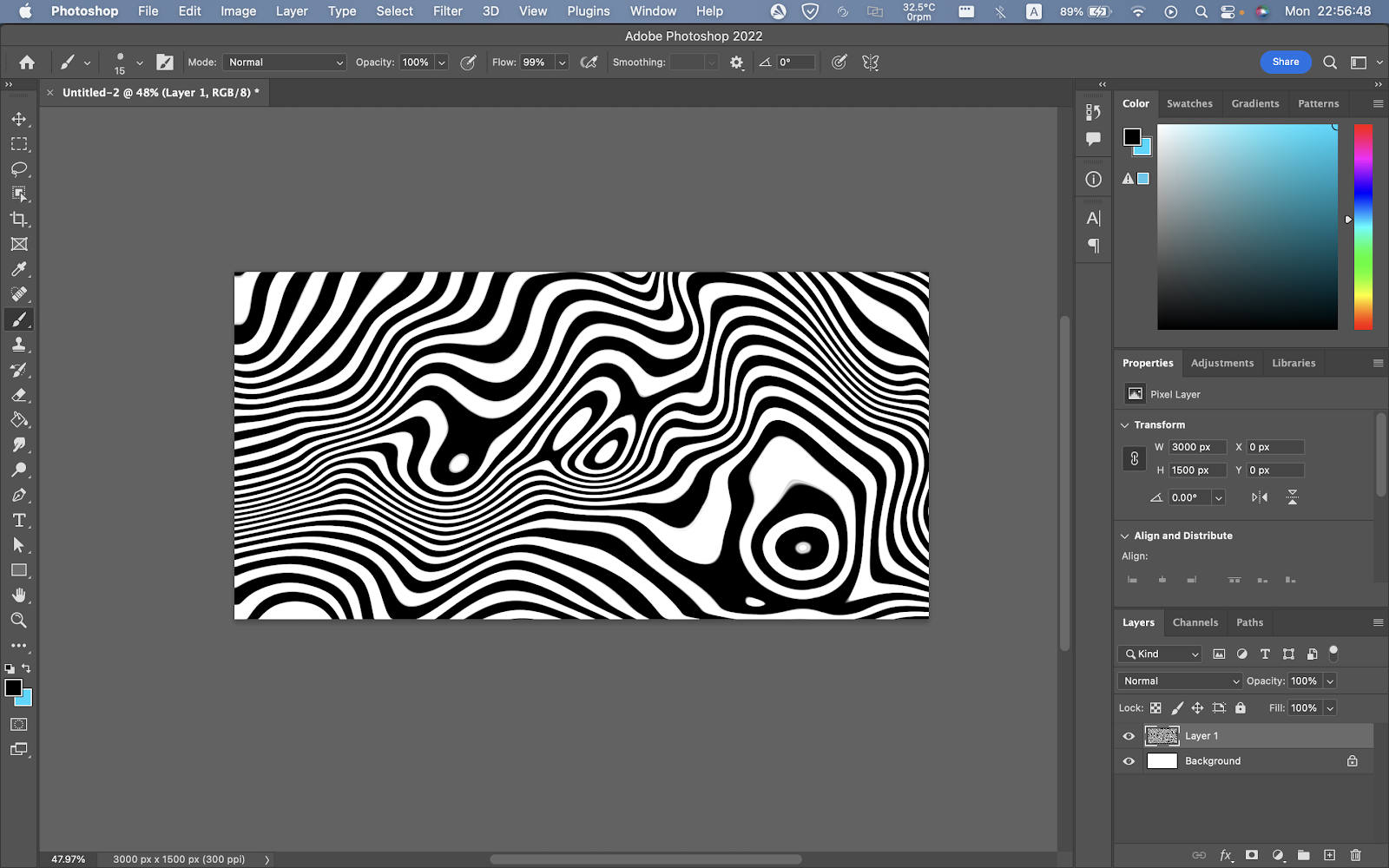
On top of the Koi fishes and solid background, I added a water-like
effect made using Liquify in Photoshop.

|
|
|
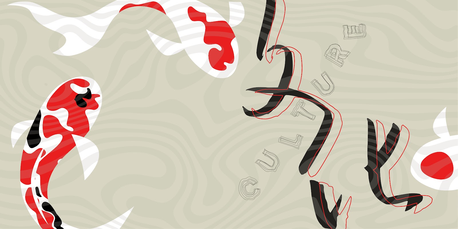
This is the design after I got my first feedback from Mr Vinod.
However, he suggested me to explore more placements of the wordings.
Instead of arranging them in the same baseline, try arranging them
according to the contour of the background. Also, I should look at some
of the work by William Herald-Wong as references.
|
|
|
|
| Fig. 2.3.3.6 (Selected to proceed) Final Option 2, Week 5 (30/09/2022) |

|
| Fig. 2.3.3.7 Final Option 3, Week 5 (30/09/2022) |
After doing some more research and a lot more thinking, I finally came
out with 3 options to move on with.
The second one was the best among the three, but further refinement was
needed: increase the size of the word 'CULTURE' by at least
200%.
After amendments, here is the end result.
Final Wallpaper Design
 |
| Fig. 2.3.4.1 Final Option 3, Week 5 (30/09/2022) |
PDF Files
FEEDBACK
Week 2
General Feedback: Mr Vinod commented on each of the typographic
system.
Specific Feedback:
Axial: blue too saturated, decrease tone.
Dialatational: bottom heavy.
Random: title does not need words with outline (only use outlines on
LARGE texts
Grids: Looks a bit off, could be positional issue.
Modular: kerning of title a bit too tight, be careful of spacing
between words
Week 3
General Feedback: It is clear that I am going for the flat
plane + highlight theme.
Specific Feedback: However, the shape and style of each
letter is inconsistent. Mr Vinod commented that I can try to base my
letters off one of the letters. For example my design of "j", I
would try and make all the letters look consistent to the style of
letter j's.
Week 4

General Feedback: The bulky parts at the ends of letters
'J' and 'E' might not be necessary.
Specific Feedback: For the highlights, they look quite
inconsistent. The thiner highlight lines are not necessary, as
well as the little protruding parts. This is becuase it won't be
seen when the leters are used at small szes anyways.
Week 5
General Feedback: The wording is too simply done.
Specific Feedback: Try seperating letter by letter on
different baselines. I may also try warping it so that it blends
better in the entire image.
REFLECTION
Experience
In this task, I was introduced to different types of
typographical systems (Exercise 1), creating a font that is
inspired by the theme of an image (Exercise 2 pt. 1), and creating a
wallpaper with typography + graphic (Exercise 2 pt. 2). Throughout exercise 1, the experience was quite smooth as I managed to arrange the information according to different typographical systems without much obstacles. So, in exercise 2 pt. 1, I decided to do something more challenging. I know pipes would be hard to turn into a font but I gave it a go still. The experience was a little tedious for me, as a lot of refinement and repeating steps were needed to be taken. As for exercise 2 pt. 2, It was really fun as I am finally able to use more graphical in a typography subject (Yes!). The experience was mostly positive as I learn my way through.
Observation
Overall, I think I have benefitted from these exercises. Besides, I somehow find myself in certain situations where I am unable to come up with more creative ideas. I tend to stay at my safe spot more often than usual. Luckily, I decided to put in more effort in visualizing and experimented more to create the design in the final exercise.
Findings
I discovered many new knowledge related to typography. One of the major ones being the importance of how we explain our designs as designers. Non-artistic people think rationally and logically and are 'visually illiterate', according to Mr Vinod. Hence, it is up to us on how we want to explain our artwork to our non-artistic clients to make them make a better choice.
FURTHER READING
Week 1 & 2 - A Type Primer 2nd Edition, by John Kane (Indicating Paragraphs, page 124-125

|
| Fig. i A Type Primer 2nd Edition, by John Kane (page 124) |

|
|
|
- The pilcrow (¶) is the first method to indicate paragraphs. It was held-over from medieval manuscripts and seldom used today.
- The second method to indicate paragraphs is simply by starting of a new line. Keep in mind that a long last line before starting a new one makes it hard to indicate the start of the next paragraph.
- The third method to indicate paragraphs is by leaving a line space between paragraphs.
- The forth method is the standard indentation, where there is a space of the length of an em dash with the same text size, in front of a new paragraph.
- The fifth is a more unpredictable method - radical type indents.
- The sixth and last method is to make the paragraph extended instead of indented.
Week 3 & 4 - A Type Primer 2nd Edition, by John Kane [Highlighting Text (Part 1), page 126-128]


- In page 126, the left example uses italic font to highlight texts, while the right example uses a bold serif typeface to do so.
- In page 127, the left example uses a bold sans serif typeface, while the right example uses a coloured text.
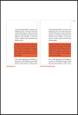
- In page 128, the left example shows the use of reversed type to highlight text, which is by placing text in front of a field of colour. The right example also shows a similar approach; however, it has indents throughout the paragraph on the left of the text. 'Maintaining a consistent left type axis in these two examples (page 128) facilitates reading, without compromising the purpose of the highlight.'
- All methods above enables contrast between the highlighted and non-highlighted texts.
Week 5 - A Type Primer 2nd Edition, by John Kane [Highlighting Text (Part 1), page 129 - 131]


- Page 129 shows the use surprinted & surprinted, indent type to highlight text.
- Page 130 shows the use of exdenting text (opposite of indenting) to highlight text. 'Sometimes it is necessary to place certain typographic elements outside the left margin of a column of type in order to maintain a strong visual axis (e.g. bullet points).
- Page 131 shows the use of quotation marks to highlight text. (Note: prime is not a single quote nor an apostrophe.


Comments
Post a Comment