Advanced Typography Task 3 (Final Project) - Type Exploration and Application
26/10/2022 - 30/11/2022 (Week 9 - Week 14)
WONG JUN ZHE / 0353613
Advanced Typography / B' Creative Media / Taylor's University
Task 3 / Type Exploration and Application
INSTRUCTIONS
MIB:
Task 3 - Final Project
0. Introduction
In this final project, I am required to choose among three options:
- Create a font that is intended to solve a larger problem or mean to be part of a solution in the area of your interest be it graphic design, animation, new media or entertainment design or any other related area not necessarily reflecting your specialisation. End result: a complete typeface generated (.ttf) + applications.
- Explore the use of typeface in your area of interest, understand its existing relationship, identify areas that could be improved upon, explore possible solutions or combinations that may add value to the existing typeface. End result: a complete typeface generated (.ttf) + applications.
- Experiment. For your idea to qualify as an experiment it must be novel and unique — working with material that might be 3-dimensional, digitally augmented, edible, unusual, typographic music video or fine art. End result: defined by student.
Requirements:
- Construct letters in 1000 by 1000 px size.
- Not allowed to directly use existing fonts, referencing is allowed.
- Real-life applications
1. Research and idea development
The following are my proposed ideas:
Ultimately, I decided on Idea #1, which is creating a typeface for
the movie 'Dracula: Untold'. One of the reasons I chose this idea is
because personally I find it the most interesting and has the most
potential. Besides, I think the existing font used for the movie
poster title does not reflect the identity of the movie.
Additionally, this is because I wanted to try creating a serif
typeface as I have tried designing a san-serif last
semester.
2. Visual References
Visual Reference 1:

|
| Fig. 1.1 Visual Reference 1, Week 9 (25/10/2022) |
This decorative / display typeface's look associates with vampires, which is the main aspect of the mentioned movie.
Visual Reference 2 (Chosen):

|
| Fig. 1.2 Visual Reference 2, Week 9 (25/10/2022) |
This is the typeface used for the credits of the TV show 'The Lord of the Rings: The Rings of Power'. This font is less decorative compared to the previous one. It also looks very elegant have potential to look associated with Dracula.
I also referred to these two additional fonts, which are other people's recreation of the credit scene typeface:
3. Refined Sketch
 |
| Fig. 2 Visual Reference 2, Week 10 (02/11/2022) |
I decided to do a sketch again to have a clearer image before
digitalising, with reference to the selected visual
reference.
4. Digitalisation

|
| Fig. 3.1 Uppercase H E O P development, Week 10 (02/11/2022) |

|
| Fig. 3.2 Uppercase H E O P Outlines, Week 10 (02/11/2022) |
 |
| Fig. 3.3 Uppercase letters + numerals + symbols, Week 11 (09/11/2022) |
Compared to my reference font, I try to make my designs look
more vampire-ish. This can be seen through some alphabets such
as H, M, N, V and W. The sharper looking lower ends of these
alphabets resembles vampire's fangs.
| Fig. 3.4 Lowercase letters, Week 11 (09/11/2022) |
Instead of designing lowercase for my typeface, I decided to design small capitals instead. In my opinion, this font's style and looks will be complimented well with the introduction of small capitals.
The small capitals are less decorative but still resembles the
weight of the strokes of each alphabet. The letters E and L
specifically are redesigned to look less decorative.
 |
| Fig. 3.5 All characters, Week 12 (16/11/2022) |
After I am happy with the designing in Illustrator, I moved them all into Fontlab accordingly.
 |
| Fig. 3.6 Fontlab all characters, Week 12 (16/11/2022) |
 |
| Fig. 3.7 Kerning (Uppercase), Week 12 (16/11/2022) |
 |
| Fig. 3.8 Kerning (Small Caps), Week 12 (16/11/2022) |
 |
| Fig. 3.9 Kerning (Numerals), Week 12 (16/11/2022) |
| Fig. 3.10 Kerning (Symbols), Week 12 (16/11/2022) |
I reuploaded and further amended the kerning for letters S and T, as there were improvements to =be made after receiving feedback from Mr Vinod.
 |
| Fig. 3.11 Final designs for S and T, Week 13 (23/11/2022) |
 |
| Fig. 3.12 Final typeface, Week 13 (23/11/2022) |
5. Applications
 |
| Fig. 4.1 Redesigned movie title, Week 12 (16/11/2022) |
I redesigned the poster title of Dracula: Untold using my typeface. I created three different variations.
 |
| Fig. 4.2 Initial poster designs, Week 12 (16/11/2022) |
After showing these to Mr Vinod, he recommended me to look up some existing movie posters and see what other elements are included in a movie poster. "More text = more potential".
 |
| Fig. 4.3 Redesigned movie poster 1, Week 12 (16/11/2022) |
 | |
|
The first application is on the movie poster itself. I created
a new title look using the font I have created. To showcase the
small capitals, I used normal capital letters for the D and A in
Dracula, and small caps for the rest of the letters. I made two
different variations of it. A complementary typeface (Univers LT
Std, 59 Ultra Condensed) is also used in the posters to give
some contrast.
 |
| Fig. 4.5 Movie tickets process, Week 12 (16/11/2022) |
 |
| Fig. 4.6 Movie tickets, Week 12 (16/11/2022) |
Next, I designed tickets to showcase my font. The ticket on the
top is a regular movie ticket, whereas the bottom one is a VIP
ticket that is usually used in premieres or pre-released
screenings. The custom VIP version of the ticket uses mostly the
font I created to bring forward the identity of 'Dracula:
Untold'.
 |
| Fig. 4.8 Merchandise t-shirt process (front), Week 13 (23/11/2022) |
 |
| Fig. 4.9 Merchandise t-shirt process (back), Week 13 (23/11/2022) |
 |
| Fig. 4.10 Merchandise t-shirt, Week 13 (23/11/2022) |
 |
| Fig. 4.11 Merchandise caps, Week 13 (23/11/2022) |
I also designed my versions f merchandise for the movie, which
includes a t-shirt and a two variations of caps. For the t-shirt
design, an image of Count Dracula from the movie and the movie title
is printed on the front; whereas, the tagline of the movie 'Every
bloodline has a beginning.' is printed on the back of the t-shirt in
a graphic-ish style. As fort he caps, the first one has a mark
printed on, while the second is the full movie title with decorative
elements that showcase its identity.
Final Outcome
Vampr all characters
 |
| Fig. 5.1 Final characters, Week 12 (16/11/2022) |
Redesigned posters
 |
| Fig. 5.2 Final movie poster 1, Week 12 (16/11/2022) |
 |
| Fig. 5.3 Final movie poster 2, Week 12 (16/11/2022) |
Tickets
 |
| Fig. 5.4 Final ticket designs, Week 12 (16/11/2022) |
Merchandise: T-shirt & Caps
 |
| Fig. 5.5 Final merchandise t-shirt, Week 13 (23/11/2022) |
 |
| Fig. 5.6 Final merchandise caps, Week 13 (23/11/2022) |
PDF File
FEEDBACK
Week 9:
General Feedback:
1. Dracula: Take a look at Rings of Power credits typeface.
2. TLoU: More towards a display typeface.
3. Overwatch: Font looks very corporate.
Specific Feedback:
1. Overwatch: Original font looks way too corporate, doesn't
show mych of the video game-ish characteristic.
2. Overwatch: Mr Vinod said my letter W looks better than the
original.
Week 10:
General Feedback:
1. The overall look of my font designs are okay, can proceed.
2. Try to think of a type of instrument (pen, brush, etc.),
and how each letter will look when written.
Specific Feedback:
1. Letter 'E' needs minor adjustments.
2. The other letter 'P' looks visually better but the 'P' I
decided on is more suited with the other letters entirity
wise.
Week 12:
General Feedback:
1. The typeface is quite consistant.
2. Think of more things that I can use as applications.
3. Refer to other well-designed posters. Posters wo'nt only
contain one fornt.
Specific Feedback:
1. The S and T needs work: S looks too thin and the shape needs
work; T stem should be thicker, crossbar should be thinner.
2. For my movie title, the A at the end of Dracula needs to be
uppercase as well, to look symmetrical.
3. I may use a sans serif typeface for other sub-wordings in my
posters (cast, starring, directors, etc)
REFLECTION
Experience
Tiring, but a good experience nonetheless.
Throughout this final project, I am exposed to creating a typeface and implementing it into several applications. In the idea development stage, I wanted to produce something different from what I did in Typography during the previous semester. Looking for references and the ideation process was quite alright as Mr Vinod has given useful feedbacks throughout the project. In terms of digitisation, the process was quite tiring and long. It took around 3 weeks to finish my first design. Then, I made minor amendments after getting feedback. As I was applying my typeface into the movie poster, I thought I could design some tickets as well, so I did. The application part was where I enjoyed the most because I just like seeing my designs in use. Overall, I am satisfied with my designs, but not entirely. I feel like I could do a better job at bringing out the vampire element, but as my first serif typeface, I take it as an experience.
Observation
The ability to not only observe, but also to critically analyse and come up with solutions might be the most important skills to ace this project. First of all in the ideation stage, observation skills are needed for me to explore different font design styles, determine whether that particular font design is suitable for its theme, and digest the essence of good font designs. Next, I also observed how similar themed fonts are designed and try to implement some of their elements into my own design. Lastly, I referred to existing posters, tickets, t-shirt, and cap designs before designing them to allow me to have a better idea on the standards.
Findings
In this few weeks, I have discovered one thing more than anything else: to work quickly and efficiently. With all the assignments from all six modules that I am taking this semester, I have to learn to produce work quickly and with quality. Other than that, I have also discovered the thinking process behind creating a typeface for a specific purpose. When a typeface does not resemble or somehow connect to the theme, it might not be a good solution, though it can be visually pleasing. One of the examples that I can think of is the overuse of minimalism. In my opinion, some things are just not meant to be minimalistic, as it is the complexity and details that gives that specific theme its character.
FURTHER READING
Article: Book Design Basics: Small Capitals – Avoiding Capital Offenses
Link: http://theworldsgreatestbook.com/book-design-part-5/
This article introduces small capitals and its uses.
 |
| Fig. i Differences Between Fake and Real Small Caps |
If we look carefully to the two types of small caps, there is a small but impactful difference. The fake small caps are uppercase letters but just in a smaller size and look unbalanced; whereas, the real small caps have the same stroke width as their uppercase counterparts, which makes them look balanced.
 |
| Fig. ii Small Caps in Paragraphs |
In the image above, a comparison is made between the use of small caps and uppercase letters. The purpose of small caps in longer texts that includes many capital letters, is to make the whole paragraph look more consistent and smooth. Hence, causing the text look more united and also does not affect readability.
Below are some situations where small caps should be used:
 |
| Fig. iii Small Caps to Indicate Time |
 |
| Fig. 1v Small caps to represent Characters in a Play |
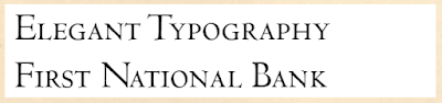 |
| Fig. v Small Caps for Elegant Headlines |
 |
| Fig. vi Small Caps to Begin a Chapter in Books |


Comments
Post a Comment