Advanced Typography Task 2 - Key Artwork & Collateral
05/10/2022 - 05/11/2022 (Week 6 - Week 10)
WONG JUN ZHE / 0353613
Advanced Typography / B' Creative Media / Taylor's University
Task 2 / Exercises

INSTRUCTIONS
MIB:
Task 2(A) - Key Artwork
0. Introduction
In this task, we are assigned to create a key artwork / mark of
myself.
Requirements:
- use initials of your name, your first name or your pet
name
- must be an elegant solution, not complicated or confusing
1. Visual research

|
| Fig. 1.1.1 JZ monogram 1, Week 6 (05/10/2022) |

|
| Fig. 1.1.2 JZ monogram 2, Week 6 (05/10/2022) |
|
| Fig. 1.1.3 JZ monogram 3, Week 6 (05/10/2022) |
|
| Fig. 1.1.4 JZ monogram 4, Week 6 (05/10/2022) |
1. Idea development + Digitisation
I have decided to start digitising right away in Illustrator, as I think the process would be quicker and more efficient since I already have a good sense of direction at this stage.

|
| Fig. 1.2.1 Initial ideas, Week 7 (12/10/2022) |
I tried to create as many marks as possible, each with a different style
or look.

|
| Fig. 1.2.2 Refined designs (1), Week 7 (12/10/2022) |
Then, I chose the ones I think would work the most and developed
variations for them. However, most of them are too decorative.

|
| Fig. 1.2.1 Refined designs (2), Week 7 (12/10/2022) |
Ultimately, after receiving Mr Vinod's feedback, I have decided that the three designs below were the better ones. However, they still need to be worked on.

|
| Fig. 1.2.1 Three better designs, Week 7 (12/10/2022) |
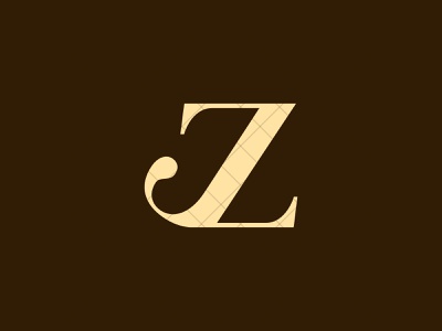
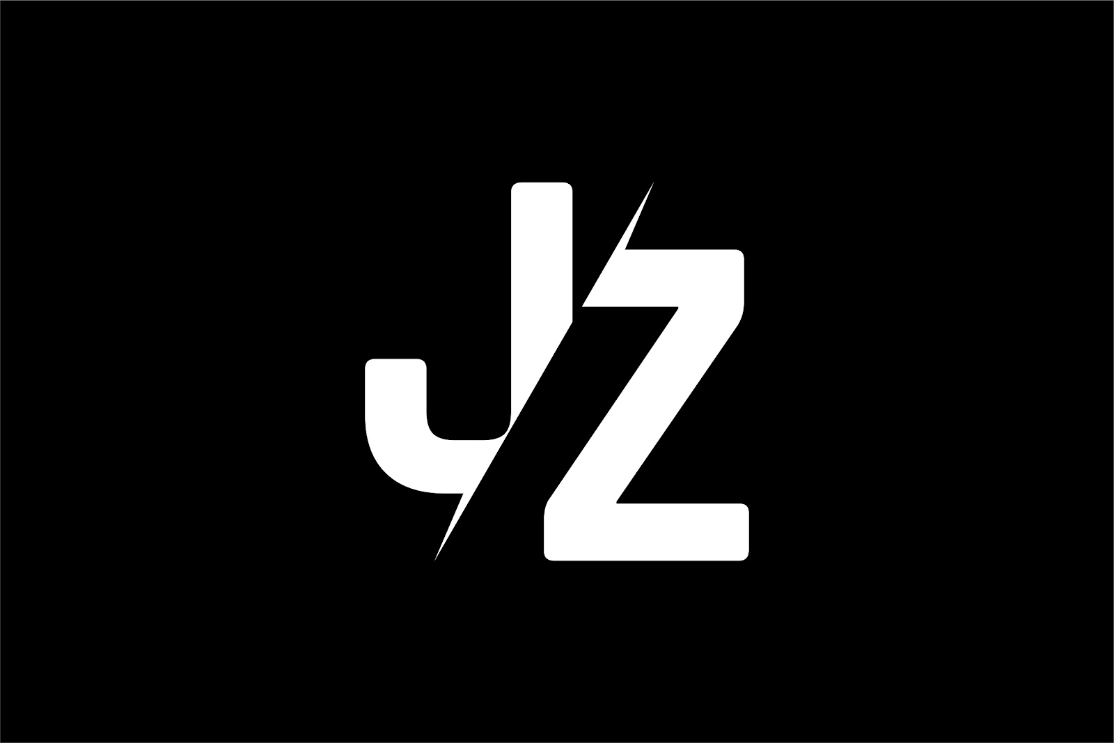
At last, I have decided to go with this one as seen below. However, the functionality is not great because at first glance, it would be mistakenly seen as ZJ instead of JZ. So I worked on it more and here is the final design.

|
| Fig. 1.2.1 Final design (B&W), Week 8 (19/10/2022) |

|
| Fig. 1.2.1 Final Design (Coloured), Week 8 (19/10/2022) |
Task 2(B) - Collateral
0. Introduction
In this task, we are assigned to design a t-shirt, lapel
pin, an animated key artwork and an Instagram account transforming the
key artwork into a brand.
Requirements:
- Animated mark: 800/1024 px, (height and width)
1. Idea development and visual research

|
| Fig. 2.1 Reference: Fujio Studio's Animated Logo, Week 8 (19/10/2022) |
While I was looking through the Internet for ideas, I cam across this gif of the logo for Fujio Studio. Before the full logo shows, there is a short animation, kind of like the logo is being drawn out.
This suits my identity well as a designer.
Besides, I want my animated mark to be perfectly timed, meaning it should
not be too long or too short. This reference I found is slightly too long
to my liking.
2. Animating my Mark
After thinking about how my animated mark should look like, I headed into
After Effects to start animating.
First, I imported the vector of my mark from Illustrator into After
effects. Then I used the 'Vegas' effect to create a cool effect that
outlines my mark.
Effect > Generate > Vegas

|
| Fig. 2.2.1 Navigate to Vegas Effect, Week 8 (19/10/2022) |
Fig. 2.2.2 Vegas Effect on Mark, Week 8 (19/10/2022)
Fig. 2.2.3 Full Animation, Week 8 (19/10/2022)
Below is the final animated mark.
Fig. 2.2.4 Final Animated Mark, Week 8 (19/10/2022)
3. Mock-ups
The following are the mockups I created based on existing templates from
the web.
Using the mock-up templates, I would just have to apply my designs from
illustrator into the .psd file.

|
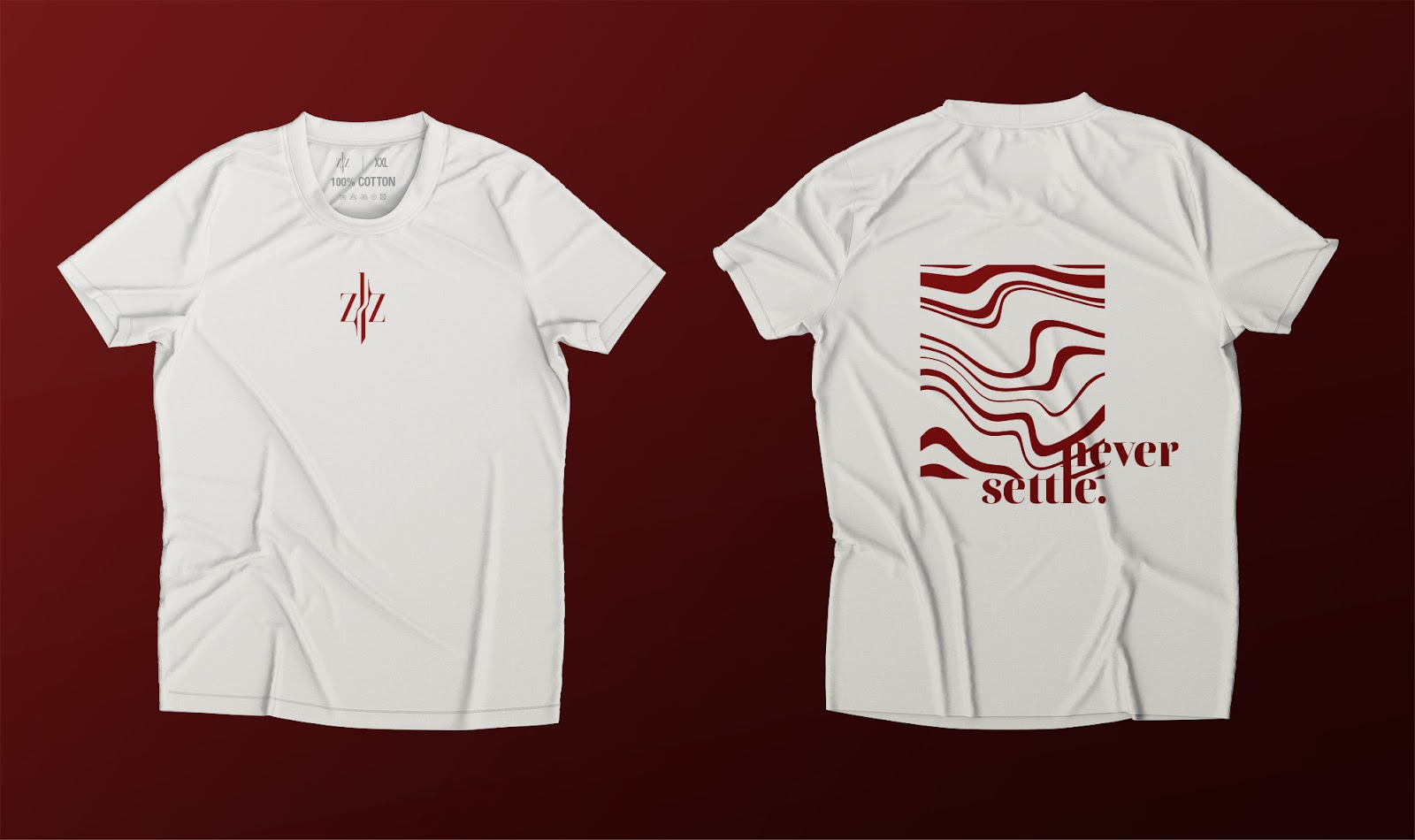
| Fig. 2.3.1 T-shirt (Back), Week 9 (26/10/2022) |
The wavy looking graphic is created using Photoshop's Liquify function.

|
| Fig. 2.3.2 Liquify in Photoshop, Week 9 (26/10/2022) |

|
| Fig. 2.3.3 Alternative Designs, Week 9 (26/10/2022) |
Compulsory:
|
| Fig. 2.3.1 T-shirt, Week 9 (26/10/2022) |

|
| Fig. 2.3.2 Lapel Pin, Week 9 (26/10/2022) |
|
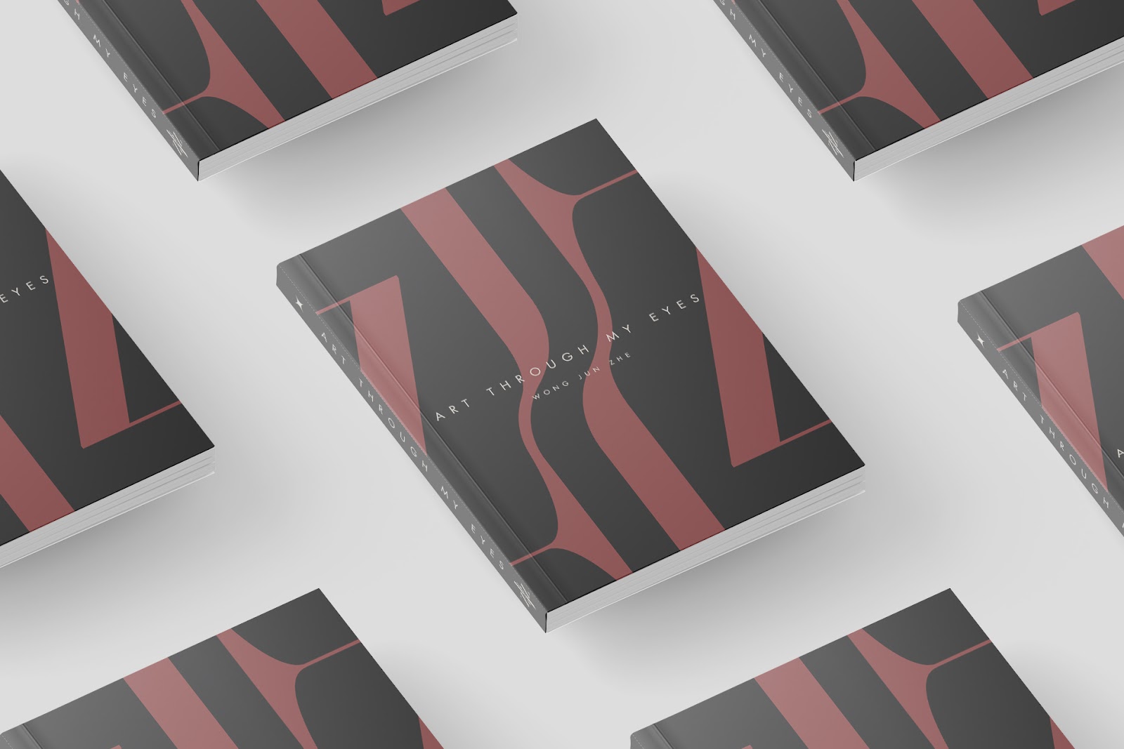
| Fig. 2.3.3 Art Book, Week 9 (26/10/2022) |

|
| Fig. 2.3.4 Business Card, Week 9 (26/10/2022) |
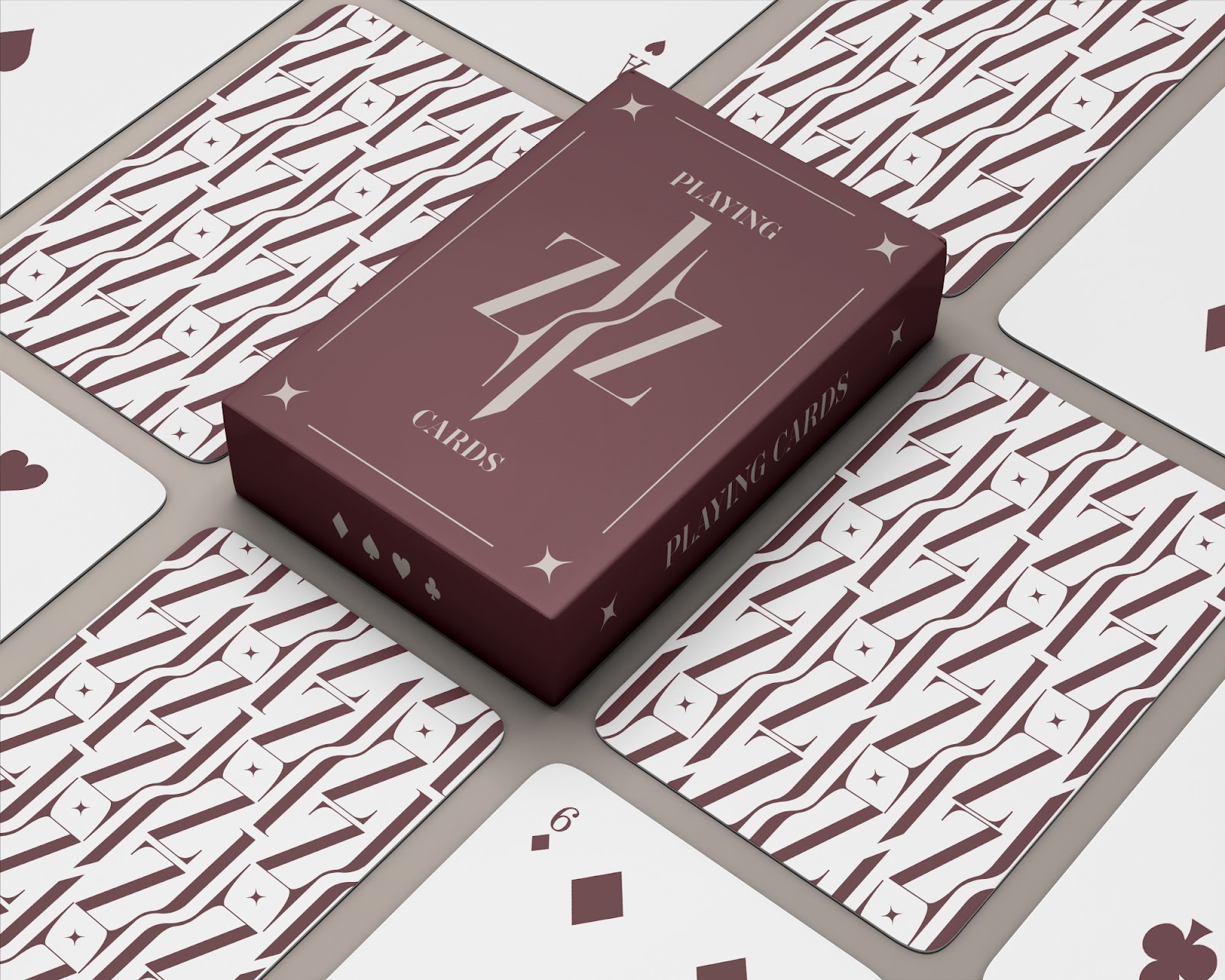
|
| Fig. 2.3.5 Playing Cards, Week 9 (26/10/2022) |

|
| Fig. 2.3.6 Textured Press, Week 9 (26/10/2022) |
4. Instagram Page Showcase
In Illustrator, I arranged everything into 9 separate art boards to
simulate the 9 tiles on the Instagram profile page.
Font used for wordings: Futura Std Light Condensed
Initial design:

|
| Fig. 2.4.1 Initial Instagram 9-tile design, Week 9 (26/10/2022) |
After looking at it after a few days, I feel like it lacks a sense of unity. So, I tweaked the colour palette a little bit.
I also replaced two of the mock-ups with the t-shirt and label pin
designs.

|
| Fig. 2.4.2 Final Instagram 9-tile design, Week 9 (26/10/2022) |
Instagram account mobile view:

|
|
|
Final Outcome - Task 2
Task 2(A) - Final Key Artwork / Mark:

|
| Fig. 3.1 Final Key Artwork (B&W), Week 8 (19/10/2022) |

|
| Fig. 3.2 Final Key Artwork (Coloured), Week 8 (19/10/2022) |
PDF File
Task 2(B) - Final Animated Key Artwork:
Fig. 4.1 Final Animated Key Artwork, Week 8 (19/10/2022)
Task 2(B) - Final Mock-ups:

|
| Fig. 4.2.1 T-shirt, Week 9 (26/10/2022) |

|
| Fig. 4.2.2 Lapel Pin, Week 9 (26/10/2022) |
PDF File
Task 2(B) - Final Instagram Page:
FEEDBACK
Week 6
General Feedback:1. Consider the overall shape of the mark, it should fit well in a square frame. However, it does not necessarily be square, but just a similar shape that fits well in the frame with good amounts of positive and negative space.
2. Produce work that can touch people's hearts with emotions is essential because clients whom we produce designs for are 'visually illiterate'.
Specific Feedback:
1. The English/Chinese name one is interesting. However, try to add something that denotes myself to show identity.
2. The symmetry is also interesting on the seond one but needs more work.
3. The top right design with a diamond between J and Z is also interesting. However, if there's already something similar that exists, ditch it.
Week 7
General Feedback:1. Would be interesting to see sketch 5 but without diamonds. However, I think it can easily confuse the viewer to seeing ZJ insead of JZ.
2. Mr Vinod thinks idea 1 is the way to go.
Specific Feedback:
1. If I were to go for idea 3, the character needs a lot more work.
Week 8
(Independent learning week)
REFLECTION
Experience
In this task, I was introduced to different types of monograms / mark / key artwork (Task 2A) and applying my mark to build a identity and brand (Task 2B). Throughout Task 2A, the experience was decent as I managed to produce many ideas so that I can pick the best one out of them. I am able to learn as I proceed with the task, about how to design a good mark. Overall, the experience was a quite tedious for me, as there are so many things to be done in such a short duration. Towards the end, I had to multitask and shift between Task 3 and finishing this task. The experience was mostly positive as I learn my way through.
In this task, I was introduced to different types of monograms / mark / key artwork (Task 2A) and applying my mark to build a identity and brand (Task 2B). Throughout Task 2A, the experience was decent as I managed to produce many ideas so that I can pick the best one out of them. I am able to learn as I proceed with the task, about how to design a good mark. Overall, the experience was a quite tedious for me, as there are so many things to be done in such a short duration. Towards the end, I had to multitask and shift between Task 3 and finishing this task. The experience was mostly positive as I learn my way through.
Observation
Overall, I think I have benefitted from these exercises. Besides, I somehow find myself in certain situations where I am totally stuck. However, after taking a break and come back to solve the obstacle again, I am able to think with a fresh mind and come up with fresh solutions. Honestly, I do not think I did my best with this task with my reason being poor time management. Due to the ginormous amounts of assignments and projects from all 6 the modules I am taking this semester, I sometimes feel exhausted and unable to be productive. Well, guess I found something to work on now...
Overall, I think I have benefitted from these exercises. Besides, I somehow find myself in certain situations where I am totally stuck. However, after taking a break and come back to solve the obstacle again, I am able to think with a fresh mind and come up with fresh solutions. Honestly, I do not think I did my best with this task with my reason being poor time management. Due to the ginormous amounts of assignments and projects from all 6 the modules I am taking this semester, I sometimes feel exhausted and unable to be productive. Well, guess I found something to work on now...
Findings
I discovered a lot of new knowledge related to not only typography, but also building a brand / identity. After looking at the example works shown by Mr Vinod, I have a better understanding on this topic now, which will definitely be useful int he future when I get a chance to build my own brand.
I discovered a lot of new knowledge related to not only typography, but also building a brand / identity. After looking at the example works shown by Mr Vinod, I have a better understanding on this topic now, which will definitely be useful int he future when I get a chance to build my own brand.
FURTHER READING
Article: Pentagram’s Paula Scher reveals powerful “anti-sanitarium” identity for the Mental Health Coalition
Link: https://www.itsnicethat.com/news/mental-health-coalition-identity-pentagram-paula-scher-graphic-design-200520?utm_content=buffere002b&utm_medium=social&utm_source=twitter&utm_campaign=intsocial&fbclid=IwAR3IP-Z8k3qOIotDNORtgvXEJMgnjnIr9V2Cx8hs118EKe0nCBhtawNomTE
 |
| Fig. i The Mental Health Coalition Logo |
 |
| Fig. ii Application of the mark on mobile webpage |
 |
| Fig. ii Application of the mark on desktop webpage |
"The designer says she hopes the “square peg in a round hole” icon will become a global symbol for mental health, inspired by Act Up’s Silence=Death AIDS campaign in the 1980s." - quoted from the website.
In the website, the designer of this logo explained the design rationale behind her decisions.
The designer describes the icon for the MHC is a square peg in a round hole, “because that’s how you feel,” referring to a connection between the icon and the theme, which is mental health.

"The typography is a tall, bold, condensed Druk in all caps, “exactly what you wouldn’t expect from a mental health site,”" - quoted from the website.
This suggests that the visual design do not conform to the typical mental health style. The designer has a unique style of spreading awareness through the design of the website.


Comments
Post a Comment