Information Design Project 1 - Instructable Poster
13/01/2023 - 27/02/2023 (Week 1 - 2)
WONG JUN ZHE / 0353613
Information Design / B' Creative Media / Taylor's University
Project 1 - Instructable Poster
WONG JUN ZHE / 0353613
Information Design / B' Creative Media / Taylor's University
Project 1 - Instructable Poster

INSTRUCTIONS
Project 1 (Part 1): Static Instructable Poster
To start off, I chose a Pasta Granny video that I find interesting, as instructed.
Youtube Video: https://www.youtube.com/watch?v=gJz3HD6WdE4&t=3s
Then, I looked for some references that I could use as guides when designing the poster. I decided that I prefer a creative, balanced design, with some sense of symmetry.
Infographics that I used as reference:
 |
| References from provided slides |
At this point, I have quite a good idea on how the poster should look like. So, I began sketching.
 |
| Sketch |
I sketched out the placement of each asset to ease my illustration process.
Then, I inserted the sketch into Illustrator, and began to work on individual assets. I mainly used both the pen tool and the brush tool. I decided to use brush tool to add some texture to the assets, so they do not look so flat.
 |
| A group of illustrated assets (flour, fresh yeast, olive oil, sugar, salt) |
 |
| Use of gradient on smoke |
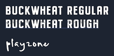
Next, for the titles and subtitles, I used a typeface called Buckwheat TC. This typeface features a san serif design that suits the look that I am going for. It also has a textured variant that I can use.
| Textured text for title |
 |
| Regular text for subtitles |
For smaller texts / descriptions, I used a typeface called Playzone. This typeface has a handwritten look and feel to it and I really like the style of this typeface.
 |
| Added other texts to show actions |
 |
| Added descriptions |
Then, I added arrows to show the flow of steps, as seen below.
 |
| 2: Toppings Preparation |
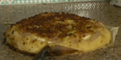
I coloured the actual Sfincione de Bagheria using the brush tool while watching the video to get the kind of shape it has. I also picked the colours from one specific frame of the video to have a more accurate colour palette.
 |
| Reference 1 |
 |
| Reference 2 |
 |
| Illustration of the end product |
To finish off, I added a 'brick wall' texture to the background and a slither of smoke that comes from the food itself. The smoke is designed to connect all 4 sub-titles by passing through them, which gives a sense of unity and flow.
 |
| Transparency panel |
 |
| BG texture |
 |
| Added smoke |
Initial Final
 |
| Initial Final - Instructable Poster |
Upon receiving feedback from Mr Hafiz, there are a few things that needs to be modifed to make the design better.
 |
| Feedback by Mr Hafiz |
Thus, I lowered the saturation and brightness of the background texture by choosing a darker, more contrasting and basically a lower-key hue: dark blue. I also decreased the saturation of the background texture so the important assets for the instructions are more clear and visible.
 |
| New BG |
Also, I added some doodles of wheat grains at the bottom of the poster to fill out some unwanted negative space.
 |
| Added doodles |
I made a few minor adjustments to the size and placement of the assets from the previous version; and finally, I am happy with the poster design.
FINAL OUTCOME
 |
| (FINAL) Project 1 - Instructable Poster |
Project 1 (Part 2): Animated Instructable Motion Graphic
Step 1: Create assets for motion graphic.
 |
| Creating assets in Illustrator |
Step 2: Separate every scene and name each layer accordingly for the ease of animating in After Effects. I also created individual files for each scene/step.
 |
| Layers |
 |
| Organised into individual files |
Step 3: Move into After Effects.
Step 4: Import all .ai files into after effects.
 |
| Imported files into AE |
Step 5: Adjust the composition settings. I decided to use 1920*1080 60fps as I think the additional frames will make the motion graphic look smoother.
 |
| Composition Settings |
Step 6: Animate.
 |
| Part of Animation I |
 |
| Part of Animation II |
 |
| Part of Animation III |
Step 7: Add some special effects (moving lines, bubbles, transitions)
"Bubble" animation
"Moving lines" animation
Step 8: Add texts; fonts used are Buckwheat and Playzone.
Step 9: Add background music. Music link - https://www.youtube.com/watch?v=_FJQ4cYu_1Q&list=PLbky1Uo8tP8CSLdGbdwFezMjDuukfUh7A&index=9
FINAL OUTCOME
- - - - - - - - - - - - https://www.youtube.com/watch?v=cdGu8XeDbcU - - - - - - - - - - - -


Comments
Post a Comment